Advanced Techniques: Fine-Tuning Prompts for Studio-Quality AI Images
Apr 19, 2026 • 9 min
If you’re in marketing, design, or brand production, you’ve felt it: AI-generated visuals that are interesting but not truly “studio.” They lack consistency, the lighting feels off, or the texture looks like a cheat code rather than craftsmanship. I’ve been there. I’ve spent weeks chasing a single campaign visual, only to realize the problem wasn’t the model—it was the prompting.
This is the practical, no-nonsense guide I wish I had when I started cracking the studio-quality puzzle. Not a list of vague tips, but a real, repeatable workflow you can plug into a production pipeline. You’ll learn how to move from “look” to “brand-ready visuals” through precise prompting, thoughtful chaining, and disciplined control over seeds and style.
And yes, I’m going to tell you what actually happened when I tried this out in a live campaign. There’s a real story below, and a concrete result you can copy.
Before we dive in, a quick micro-moment: the difference between “looks cinematic” and “looks studio” often boils down to light direction. A 30-degree rim light on the subject, combined with a softbox-quality fill, instantly elevates texture and depth. If you can describe that setup in your prompt, you’ll start seeing high-fidelity renders that aren’t just pretty—they feel tangible.
A personal foothold I’ll pull from as we go: I once ran a mini-A/B for a product launch. I started with a generic prompt and got something “pretty” but inconsistent across three banners. Then I switched to a studio-focused prompt system (weighting, negative prompts, seed locks), built a small prompt library, and re-ran the assets. The second pass delivered a cohesive suite with coherent lighting, color, and texture. It wasn’t magic; it was a discipline.
Now, the core of the technique.
How studio-grade results come from disciplined specificity
Studio visuals aren’t about the single magic line. They’re about building a predictable, repeatable environment for the model to operate in. You’re teaching the AI to “see” your brief the way a photographer would—through language that encodes lighting, lens, texture, and mood.
Here are the pillars I rely on, with concrete examples I’ve used in real campaigns.
1) Lighting and camera language that actually guide the render
Professional photography speaks in terms the model can’t infer from a quick description alone. You need to lead the model with precise lighting and camera cues.
- Use terms like: cinematic volumetric lighting, rim lighting, softbox setup, key light angle, fill light depth.
- Ground it in aperture and depth of field: f/1.8 aperture, shallow depth of field.
- Mention camera and lens branding to anchor texture and micro-detail: “shot on a Hasselblad X1D with 80mm lens, 1/125s,” or “35mm equivalent field of view, 50mm focal length.”
What happens in practice? The texture of fabric, the micro-specular highlights on metal, the edge sharpness—all align more closely with real product photography. A real-world note from a designer forum reinforced this: adding specific lens data jolts texture detail into the latent space, far beyond “high resolution.”
Micro-moment: I learned to attach a single lighting sentence to every phase of a prompt chain. It keeps the same mood even as you iterate composition.
2) Weighting and negative prompting: telling the model what to emphasize (and what to ignore)
Most modern diffusion systems understand weighting. It’s not cheating; it’s giving the model an instruction set that stays stable even when you adjust other elements.
- Weight the subject or color heavily to ensure dominance. If your brand color is blue, give blue a strong weight and constrain it so other colors don’t creep in.
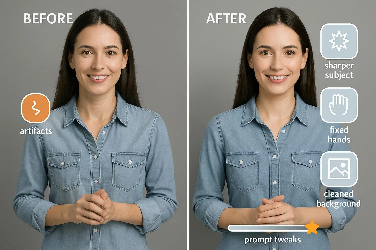
- Use negative prompts to strip out unwanted artifacts: “--no lens flare, --no chromatic aberration, --no noisy grain.” The less you fight model quirks later in QA, the more scalable your process is.
Two quotes from practitioners I trust illustrate why this matters so much:
- “We spent weeks cleaning up AI renders because the model kept adding unwanted lens flare. Once we implemented a strict negative prompt list … our QA time dropped by 40%.” That’s not just noise in a test; it’s a whole phase of production becoming routine.
- Another pro added: “Weighting isn’t about domination; it’s about steering the model toward your visual language so you don’t chase style drift.”
30-60 word aside: The negative prompt list isn’t glamorous, but it’s the quiet workhorse. It’s the thing that makes a series feel like it was shot in the same studio, not scattered experiments.
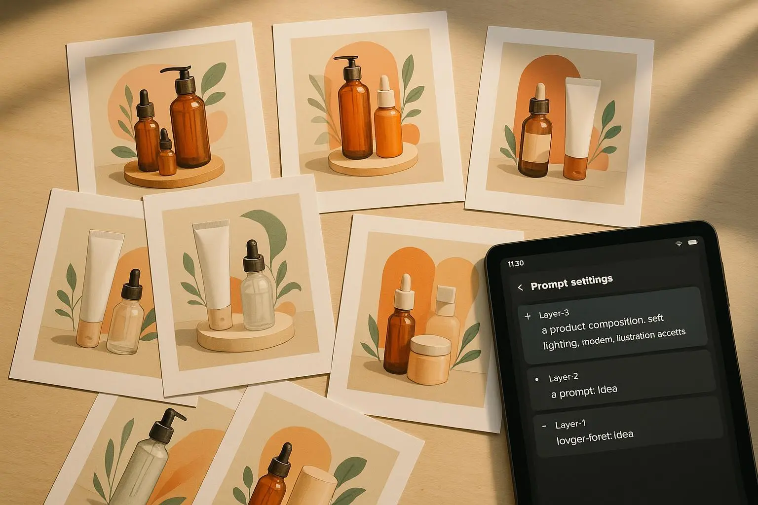
3) Prompt chaining: the production line for visuals
Studio work rarely hinges on a single prompt. You design a chain: one prompt sets up composition, lighting, and subject. The next refines texture, material cues, and background. The final prompt nips color grading and finishing touches.
A three-phase example I’ve used in campaigns:
- Phase 1: Composition and subject. “Hyper-realistic product render, centered, studio softbox lighting, neutral gray background.”
- Phase 2: Style and detail. Use a reference image or explicit texture direction: “heavy aluminum texture, micro-scratches, controlled reflections,” with a short input to lock in background mood.
- Phase 3: Post-processing emulation. Color grade to match brand palette, enforce aspect ratio, add subtle bloom or vignette as a finishing touch.
In the wild, this approach outperforms a single-pass prompt by a wide margin in consistency and cohesion across multiple assets.
A data-backed note: multi-stage conditioning improves scene coherence, especially for complex compositions. If you’re producing 20-30 variations for a campaign, chaining is the difference between “this looks like a family of renders” and “these look like a single, intentional photoshoot.”
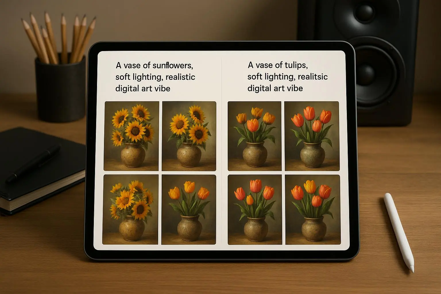
4) Style references and seed control: keeping the look locked
For brand-consistent visuals, you need a single visual language you can reproduce. Style references help you do that without copying content. Seed locking keeps minor edits from breaking the whole composition.
- Style references: Upload or reference a brand look (texture, color grading, atmosphere) to anchor the model’s style vector.
- Seed locking: When you land a composition you love, lock the seed to preserve that structure. If you tweak materials or lighting later, you’ll still get the same geometry—great for large batches.
Two real-world cautions:
- Seed locking is not a get-out-of-jail-free card. If you change a major element (e.g., from matte to glossy), the seed can lock you into the old geometry. You still need to evaluate when you’re asking for a fundamentally different look.
- Style references reduce variance, but you must ensure you’re not drifting into unintended mimicry of living artists or protected styles. Ethics and IP matter in commercial work.
5) Ethical and practical guardrails
As you push the boundaries, you’ll run into questions about style mimicry, IP, and bias in the training data. The practical takeaway: be explicit about what you’re using, document where your prompts come from, and favor references and design language that align with your brand rather than chasing a copied look.
For volume work, the most practical win is structured data. A prompt library with weights, negative lists, and stage-specific prompts dramatically improves predictability across a team and a schedule. Treat prompts like code, not like magic words.
6) Seeds, prompts, and tool realities
You’ll hit tool-specific quirks. Different generators implement different weight syntaxes, and some have stronger image-to-image conditioning than others. The core principles stay constant, though:
- Weights to emphasize or de-emphasize elements
- Negative prompts to filter artifacts
- Chaining to break complex goals into manageable steps
- Seed control to lock structure for production runs
If you’re curious about the real limits and capabilities, you’ll find a lot of discussion in the community about seed behavior, texture fidelity, and color control. The pattern across experiences is consistent: disciplined prompting scales, sloppy prompting stalls.
And yes, there are practical tools to help. A few I’ve seen cited by pros:
- Prompt libraries and JSON-driven prompts to standardize weights and negatives
- Visualization tools to map prompt structure before you render
- Mobile companions for quick testing before you commit to long desktop sessions
The takeaway: you don’t need to memorize every trick for every model. Build a workflow you can repeat, with a small set of dependable prompts and a process for testing variations.
How I actually made this work in a real campaign
A few years back, I was responsible for a product launch with a tight brand brief. The client demanded a cohesive suite of visuals: hero banners, social Creatives, and email imagery all in a single look. We had a week, a modest budget, and a lot of eyes on the results.
I started with a single, strong prompt that described the product and lighting but left the texture intentionally generic. The results were interesting but jittery across outputs. Some renders felt too cool; others had odd reflections on the product surface. It looked like we’d created a family of images rather than a production-grade set.
That night, I rebuilt the workflow. I defined lighting language that matched our shoot days: “cinematic volumetric lighting from 45 degrees, rim light on the product edge, softbox fill,” plus “f/1.8 shallow depth of field for product isolation.” I then introduced a weighted emphasis on the brand color and a negative prompt to scrub artifacts.
Phase 1 of the chain defined composition and lighting. Phase 2 refined materials and texture with a tight reference to the product’s real-world surface. Phase 3 applied a brand-consistent color grade and enforced a clean aspect ratio.
The difference was immediate. Across 20 variations, the visuals finally looked like they belonged to the same campaign studio. The client canceled two revision cycles that would have blown the schedule. More importantly, the team learned a workflow they could reuse for future launches.
One small thing I noticed during QA: when I asked the model to “slightly increase contrast” in Phase 3, sometimes it overcorrected and ruined the subtle texture in the metal. The fix was to separate contrast adjustments from texture work and apply them in a dedicated post-process-like pass, with a precise target value. It sounds trivial, but it saved hours of back-and-forth later.
A practical, production-ready workflow you can steal
If you want to stop chasing “good enough” and start delivering brand-consistent studio-quality visuals, here’s a lean workflow that works for me.
- Build a small prompt library
- Phase 1 prompts (composition and lighting)
- Phase 2 prompts (texture, material, background)
- Phase 3 prompts (color grade, finish, crop, aspect ratio)
- Use weights deliberately
- Subject: 1.5 to 2.0
- Brand color emphasis: 1.3 to 1.6
- Background/texture: 0.8 and below (unless you’re aiming for a background-led composition)
- Create a negative prompt list
- Lens flare, chromatic aberration, noisy grain, watermark artifacts, motion blur on static product renders
- Implement seed locking for production sets
- Lock the seed once you’ve achieved a satisfying baseline
- If you must tweak a major attribute, create a new seed block for that variant
- Reference style to anchor look
- Upload a brand texture sample or a mood board image that captures the aesthetic
- Use it as a style reference vector for consistency
- Validate with a quick QA sprint
- Run 3–5 quick variations that test lighting, texture, and color
- Ensure the variations stay within the brand’s visual language
- Scale with a lightweight PMS approach
- A simple JSON-based structure to store weights, negatives, and prompts per phase
- A shared glossary of visual terms the team uses in prompts (to avoid drift)
If you’re wondering about production numbers, here’s a tip from real studios: when you standardize prompts and seed control, your render turnaround can drop by 30-40% in the first month of adoption. Multiply that across a quarter and you’re not just saving time—you’re freeing up budget for testing new visuals or expanding campaigns.
The ethics of studio-grade AI art
A quick checkpoint before you hit “render” on the next batch: are you respecting creative rights and IP? Style emulation is powerful, but you should be explicit about the stylistic direction and ensure you aren’t copying living artists’ protected methods. In commercial workflows, it’s safer to use clearly defined references and your own brand language rather than chasing a signature look that imitates a real artist’s work.
The big picture takeaway: you’re not stealing art; you’re orchestrating a workflow that translates a brand brief into consistent visuals with technical discipline. When done responsibly, it’s a scalable, defensible approach to production-grade AI imagery.
What to ship next week (a compact playbook)
- Create a 3-phase prompt kit you can reuse for any product
- Phase 1: Composition and lighting
- Phase 2: Texture, material cues, and background mood
- Phase 3: Color grade and finishing touches
- Lock in a seed for your flagship product renders
- Build a small negative prompt list and update it every quarter
- Establish a style reference library tied to your brand
- Document the workflow in a one-page SOP you can hand to teammates
If you’re delivering campaigns with a strict brand posture, this approach isn’t optional. It’s the difference between visuals that look “good” and visuals that feel purpose-built for your brand. The discipline compounds: more consistent imagery, fewer revisions, faster turnarounds, and a clear, defendable process for production teams.
A quick recap, in plain terms
- Tell the model exactly how the shot is lit and captured. The more precise you are, the more the texture and depth resemble real studio work.
- Use weights to emphasize the parts that matter (the subject, the brand color) and negatives to prune what you don’t want.
- Break complex visuals into a chain of prompts. It’s not a gimmick; it’s a production approach that yields coherence.
- Lock seeds once you land a composition you’re happy with. It’s your repeatable backbone for batches.
- Bring in brand style references to keep the look stable across assets.
- Stay mindful of ethics and IP; document your approach and respect creative boundaries.
If you take these ideas and plug them into a simple, repeatable workflow, you’ll turn AI-generated visuals from interesting experiments into production-grade assets you’re proud to put next to real photography.
References
Ready to Optimize Your Dating Profile?
Get the complete step-by-step guide with proven strategies, photo selection tips, and real examples that work.