Master Prompts & Composition for AI Covers
Jan 24, 2026 • 9 min
If you want AI-generated covers that convert—book jackets that sell, album art that hooks listeners, or marketing visuals that stop a scroll—you need to stop treating prompts like wish lists.
I used to fling adjectives at the generator and hope the algorithm would sew them together into something usable. That gets you one passable image out of twenty. Professional work needs repeatable control. That means structure, exclusion, compositional language, and a workflow that accepts post-processing as part of the job.
This is a practical guide. No fluff. Read it, try the examples, and you'll waste far fewer hours chasing "almost right" outputs.
Why prompt structure beats keyword salad
The difference between "a pretty image" and "a marketable cover" is hierarchy.
Think of a prompt as instructions to a crew on set. You don't tell the gaffer, the art director, and the costume designer the same thing. You tell each person what they must prioritize.
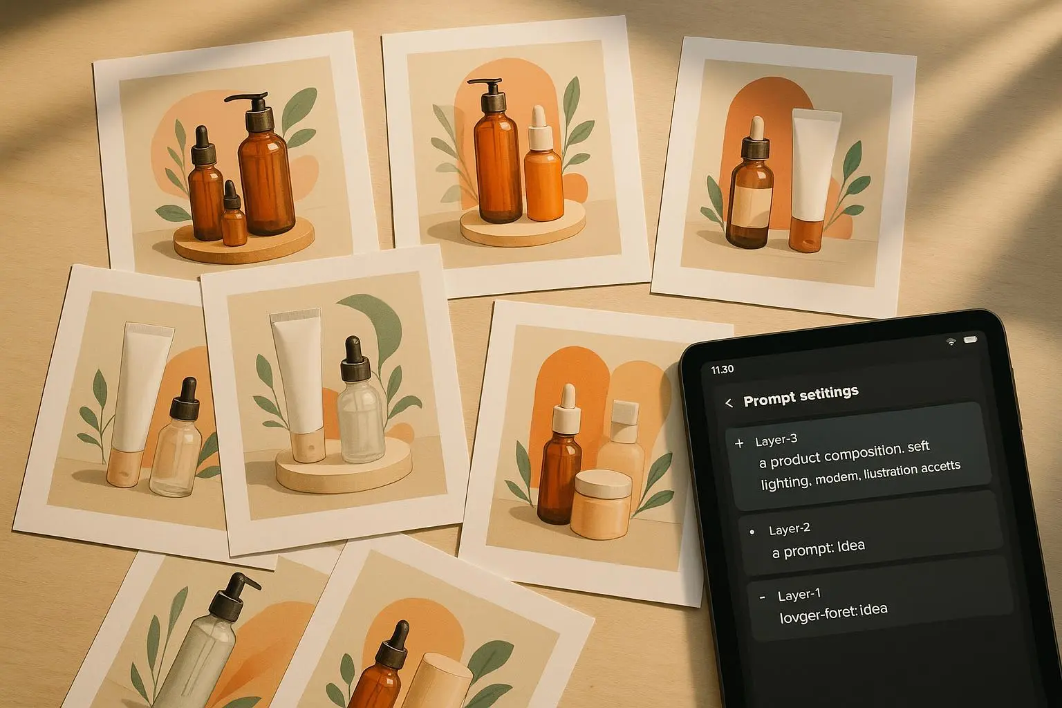
I break prompts into four layers:
- Subject (who/what is the star)
- Environment (where it sits)
- Style/Medium (how it looks)
- Technical details (camera, aspect ratio, lighting, negative space)
A single-line laundry list flattens those roles. When you separate them, you can tweak mood, scale, or camera without redoing the whole concept.
Example structure: [Subject: lone traveler, hooded, silhouette] | [Environment: misty canyon, massive stones] | [Style: cinematic, high-contrast, painterly] | [Technical: 2:3 aspect ratio, shallow depth of field, rule of thirds]
That's readable, debuggable, and fast to iterate on.
Weighting: force the model’s attention where you need it
Parentheses, repeated phrases, or numeric weights let you nudge the model's priorities.
In practice:
- (dramatic lighting:1.3) — makes lighting more decisive
- ((hooded silhouette)) — doubled emphasis for mid-level UIs
- color:0.8 — you can downweight an element too
A friend on a fantasy cover project told me they were stuck with muddy lighting until we dialed the lighting weight from 1.0 to 1.25. Suddenly the subject popped, not the sky.
Weighting is not magic. It’s about diminishing randomness and amplifying intent.
Negative prompts: the thing people skip until they need it
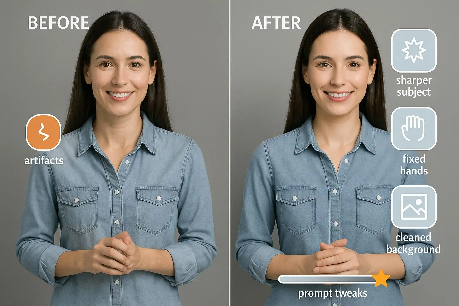
This is the single biggest time-saver. Negative prompts tell the model what to avoid. If you don’t use them, you’ll get unwanted artifacts: extra limbs, bad hands, strange text, or watermarks.
Build a negative prompt checklist for covers: low resolution, watermark, signature, deformed, extra limbs, blurry text, cropped, ugly, distorted perspective, noisy background
One designer I follow said their success rate jumped from 20% to 80% after applying a curated negative list. That matches my experience: negative prompts eliminate a ton of false positives so you get usable drafts faster.
Pro tip: maintain a “project negative” file. Copy it into every prompt. Over time you’ll add project-specific negatives (e.g., "no neon" for fantasy projects that don’t want sci-fi vibes).
Composition by language: control the focal point
You can’t move the camera physically, but you can use camera language to mimic professional composition.
Useful phrases:
- rule of thirds composition
- centered subject, wide angle shot
- cinematic close-up, shallow depth of field
- subject looking directly at viewer
- Dutch angle for tension
If you want depth, explicitly add foreground/midground/background tags: [Foreground: broken sword, mossy], [Midground: female protagonist, cloak], [Background: storm-lashed cliffs, distant castle]
That stops the AI from flattening everything into a single plane. For series covers, locking a seed keeps composition constant while you edit color or type placement.
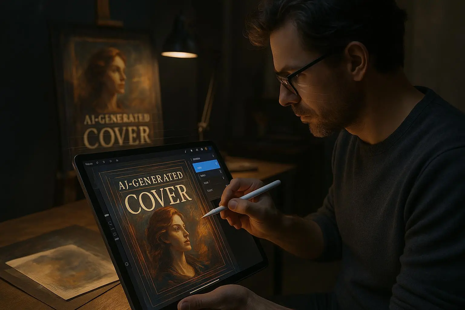
The typography problem and the real workflow
AI text rendering is improving, but for professional typography you treat the AI image as a base—reserve space for text, then add it in post.
How to prompt for typography-friendly images:
- "poster design, negative space at top third for title"
- "minimalist cover, centered subject, ample space above and below"
- "leave room for large serif title at top; avoid busy patterns in upper 30%"
Then export to a layout tool: Canva, Photoshop, Affinity, or Procreate.
I will say it plainly: the AI saves roughly 80–90% of the creative slog. The last 10–20%—kerning, font pairing, contrast for legibility—still needs a human. Treat that as the value you add, not the failure of the tool.
Iteration tactics: seeds, references, and prompt stacking
Iteration is your friend. Here’s how to keep it fast and precise.
Lock a seed when you have a composition you like. Then:
- tweak color palettes (e.g., "muted teal gradient overlay")
- change lighting (e.g., "golden hour rim light:1.2")
- swap props (foreground artifact changes)
Prompt stacking: generate a base image, then use that image as a reference in the next pass with small editing prompts. This is especially useful when you need variations across a series—same composition, different color or character expression.
Style references matter. Instead of "oil painting" try "oil painting in the style of J.M.W. Turner" or "cinematic lighting inspired by Roger Deakins." Specific references push results into recognizably higher-quality aesthetics.
A real story: how I learned to stop apologizing for post-processing (150 words)
I had a client who wanted a dystopian paperback cover—moody, gritty, but clean type space. I generated fifty images across two weeks. Half had interesting textures but terrible typography areas; the rest were flat or cluttered. I was arguing with the model and getting nowhere.
Then I changed the game: I wrote layered prompts, added a strict negative list, locked a seed on one composition, and promised myself I would not try to coax readable text out of the generator. I reserved the upper third for the title and exported five final images. In Photoshop I spent 25 minutes placing fonts, adjusting contrast, and doing minor inpainting on a single image. The client picked one, and the book sold 1,200 copies in the first six months—my fastest-selling indie release at the time.
Lesson: accept that AI is the creative engine, not the typesetter. Post-processing is where the conversion happens.
Micro-moment: the tiny detail that saved a cover
One night, exhausted, I noticed a tiny bright spec in the lower-left corner of a generated image. It pulled the eye away from the subject. I added "no bright speckles, no lens flare unless specified" to my negative list. Simple change. One fewer visual distraction per image. You won’t believe how many tiny things like that add up.
Troubleshooting common artifacts
Issue: extra limbs or malformed hands Fix: add "deformed, extra limbs, malformed hands" to negatives and prompt for "hands visible, normal anatomy" if hands must be seen.
Issue: unintended text or signatures Fix: negative terms "signature, copyright, watermark, text" and reserve space explicitly for your title.
Issue: flat images with no depth Fix: add "foreground, midground, background" elements and camera cues: "50mm lens, shallow depth of field" or "wide-angle, dramatic perspective."
Issue: inconsistent series look Fix: lock seed for composition, vary color and lighting weights, and use the same style reference across images.
Tools and practical stack
You’ll get the best results when you combine generation and refinement. My recommended stack:
- Generation: Midjourney or Stable Diffusion (Automatic1111 for fine control)
- Compositional enforcement: ControlNet for pose/layout fixes or inpainting
- Cleanup & text: Photoshop, Procreate, or Canva for typography and export presets
- Upscaling: Krea AI or native upscalers in Midjourney for print-ready resolution
Use the right tool for the job. Midjourney is fast and beautiful for concepting. Stable Diffusion + Automatic1111 gives you parameter-level control. Then move to your editor for the last mile.
Legal and ethical quick note
Commercial use rules vary by model and provider. Always check the license and, if you're using style references that are too close to living artists, avoid direct mimicry without permission. There’s a growing conversation about credit and compensation—be mindful and document your sources.
Quick prompt templates you can copy
Base cinematic fantasy cover: [Subject: lone traveler with cloak, silhouette, looking left] | [Foreground: cracked monument] | [Midground: path leading to distant citadel] | [Background: stormy sky, lightning] | cinematic, dramatic rim lighting (1.2), 2:3 aspect ratio, rule of thirds composition, negative space at top third for title | Negative: low resolution, watermark, signature, deformed, extra limbs, blurry text
Minimalist non-fiction cover: [Subject: single icon—feather pen] | [Environment: clean textured paper background] | minimalist, flat vector, soft shadows, muted palette | 1:1 aspect ratio, negative space at center, grid-aligned composition | Negative: noisy background, busy pattern, unwanted typography
Use these as starting points and tweak weights, style references, or negatives to match your brief.
Final thought: make the AI do the heavy lifting, not the whole job
AI gives you control, but control comes from discipline: structured prompts, careful negatives, compositional language, and an acceptance that final typography is a human task.
If you adopt one habit from this piece, let it be this: build a repeatable prompt template and a negative checklist you use on every project. Your first drafts will improve overnight; your production time will shrink; your covers will start behaving like the business tools they are.
References
Ready to Optimize Your Dating Profile?
Get the complete step-by-step guide with proven strategies, photo selection tips, and real examples that work.