ArtDraft Troubleshooter: Common Issues in Text-to-Image Rendering and Fixes
Apr 15, 2026 • 9 min
If you’re dabbling in text-to-image art, you’ve probably hit the same brick wall I did a while back: outputs that look decent at first glance but fall apart on closer inspection. Blurry backgrounds, harsh color stripes, weird artifacts, or a vibe that never quite aligns with the prompt you fed in. It’s frustrating, and it’s completely solvable with a workflow you can apply in 30-minute bursts.
I’ve spent the better part of two years chasing clean, studio-grade AI art. I’ve made every mistake you can imagine—too-broad prompts, wrong aspect ratios, zero plan for post-processing. And I’ve learned to stop treating AI generation like magic and start treating it like a craft. This piece is the honest, practical guide I wish I had when I started.
But first, a quick moment I won’t forget. I was training a batch of landscape scenes and kept getting muddy skies. I added more adjectives, swapped a model, tried a higher resolution, and still the horizon kept dragging into a dull gray. Then I taped a sticky note to my monitor: “Always check the light source.” It sounds obvious, but that tiny reminder saved me days of back-and-forth. A small nudge like that—a micro-moment—can change how you approach a render.
So what’s inside? A hand-built toolbox for common issues, with concrete steps you can actually run through. I’ll share a real story from my own experiments, plus the exact fixes I rely on today. No fluff. Just practical, repeatable tactics you can apply to your own art.
Note: this isn’t a hollow list of problems. It’s a narrative of how I learned to diagnose and fix these problems, and how you can build a similar, repeatable flow.
How I actually make this work
If you’ve ever felt like you’re chasing a moving target, you’re not alone. The landscape of text-to-image models is constantly shifting—Midjourney, Stable Diffusion, DALL-E, and friends all have their quirks. The trick isn’t to pin one model and pretend it’s perfect. It’s to build a process you can adapt to the tool you’re using, and to the art you want to create.
Here’s the framework I use, with concrete steps and examples you can borrow.
- Start with a strong visual goal in your prompt. The more you can specify, the less guesswork the model has to do. If your aim is a “cinematic fantasy landscape,” ask for “a misty valley at golden hour, distant floating mountains, a ribbon of a river reflecting amber light, hyper-detailed foliage, and a sharp focal point on a weathered temple in the foreground.”
- Nail the mechanics first. Do a quick pass to lock in composition, lighting, and subject. Then layer in texture, color, and mood. This prevents a lot of artifacts from sneaking in while you chase aesthetic.
- Treat post-processing as part of the workflow, not the afterthought. Upscaling, color correction, and minor retouching are essential if you want professional results.
I’ve learned this through countless iterations, but there’s one deeper truth I keep in mind: good AI art is less about fighting the tool and more about guiding it with intention.
Now, let’s get into the five big problem areas I hear about most—and how I fix them in practice.
1) Low detail and blurry outputs
This one is a reliability killer. You want crisp, intricate detail, not a watercolor blur.
What usually causes it
- Prompts that are too general or vague.
- Prompts that try to push too much at once, confusing the model.
- Going straight to high-resolution output without ensuring the base render can support it.
- The model’s inherent limitations on rendering fine structure in distant backgrounds or complex textures.
What I’ve learned from real-world sessions I remember a day when I was building a fantasy city at dusk. I asked for “a sprawling city with lantern-lit streets.” The foreground buildings looked decent, but everything receded into a fuzzy haze. I realized I’d skipped a crucial step: I hadn’t defined focal depth. The near elements needed plain, crisp edges to anchor the scene, while the background could carry atmosphere.
The fix, in practice
- Elaborate prompting: be precise about foreground, midground, and background details. For example: “foreground: detailed stone archways with moss, midground: a river reflecting sunset, background: distant towers with fine spires.”
- Emphasize resolution and focus: include phrases like “highly detailed,” “photorealistic,” and “sharp focus on foreground elements.”
- Upscale smartly: after you get a base image that’s reasonably detailed, run it through a reputable upscaler that preserves line work and texture rather than just blowing up pixels.
- Use a negative prompt to push away soft, undefined areas: terms like “blurry,” “unfocused,” and “low detail” can act as a shield if your settings lean toward softness.
A quick, concrete approach you can steal
- Step 1: Prompt for depth. “Foreground: highly detailed stonework with crisp edges; midground: river with reflective ripples; background: hazy mountains with defined silhouettes.”
- Step 2: Add a focus cue. “Subject in focus: the temple facade in the foreground.”
- Step 3: Pick a resolution you know you can support. If your base render is 768x768, set upscaling to a 2x upscale with preservation of edges.
Real-world aside I once chased a dragon scene that kept coming out soft around the scales. After tightening the prompt to lock in a high-detail macro texture on the dragon’s head and telling the system to preserve edge detail, the output snapped into focus. The change wasn’t dramatic, but the crispness made the final composition feel real enough to print in small format.
30-second micro-moment If you notice a soft background, but clean foreground, try a quick test: re-render only the background with a separate prompt while keeping the foreground fixed. It’s a simple split of roles—the model loves a clear task division.
2) Color banding and inaccurate hues
Color fidelity is one of those things that can ruin a scene quickly if you’re not paying attention.
What goes wrong
- Gradients show visible steps rather than smooth transitions.
- Hues swing off-target, especially in sunset or neon-heavy scenes.
- Compression artifacts creeping in during export.
What the community is saying People complain about sunsets breaking into blocky stripes, which pulls you out of the moment. The insights you’ll find in online communities are filled with “color banding” worries from artists who push palettes.
What works in practice
- Specific color language matters. Instead of “blue,” call out a palette: “azure to sapphire gradient,” or “sunset gradient from coral to burnt orange.”
- Prefer higher bit depth and lossless exports when possible. If your tool supports PNG-16 or TIFF, use it. Save for web JPEG only if you absolutely need compatibility.
- Don’t skip post-processing. A light color grade in your favorite editor can restore balance and smooth gradients.
A simple workflow you can adopt
- Step 1: In-prompt color mapping. “Gradients should read from deep ruby to soft rose at the horizon, with a cool blue sky.”
- Step 2: Choose a higher bit-depth/export option.
- Step 3: Check in a photo editor and apply a gentle gradient smoothing pass if needed.
- Step 4: If the palette still feels off, push a negative prompt against overly saturated, posterized, or poster-grade hues.
Story time I once generated a sky that had abruptly banded bands of magenta and cyan, completely at odds with a warm sunset. After re-prompting with a gradient description and exporting a PNG with a higher color depth, I used a quick hue-curvature adjustment in a photo editor. The result was a believable, natural sunset with a subtle, glassy gradient that felt intentional rather than forced.
Small aside A tiny detail that sticks with me: the moment you realize the hue of a single cloud can anchor the entire mood of a scene. It’s amazing how a 2–3% shift can align everything.
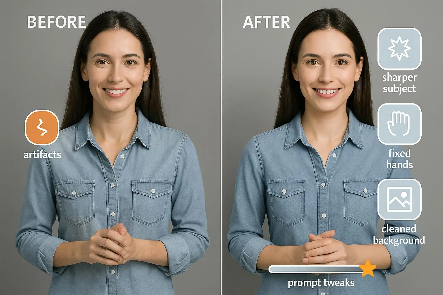
3) Unwanted artifacts and distortions
Artifacts pop up as extra limbs, odd shapes, or objects that don’t belong. They’re the AI’s way of misinterpreting a prompt or resolving ambiguity in noisy latent space.
What triggers artifacts
- Overly dense prompts that try to pack in too much action at once.
- Complex human anatomy or interaction prompts without breaking them into simpler steps.
- Seed and sampling issues that produce odd baselines.
What I learned on the front lines I was experimenting with a figure holding an ornate cup in a fantasy setting. I ended up with a three-handed person holding a bowl of fish. Hilarity aside, it highlighted a classic problem: the model struggled with intertwined prompts and fine human anatomy.
The fixes that actually work
- Iterative prompt refinement: start with a simple pose, confirm the basics, then add elements one at a time.
- Negative prompts to suppress the exact artifacts you keep seeing. If you keep getting extra limbs, add “no extra limbs,” “no deformed anatomy.”
- Seed exploration: rotate seeds to find a baseline that doesn’t create the artifact pattern you hate.
- Inpainting and outpainting: fix small patches or extend a canvas to correct a piece without regenerating the whole image.
A practical sequence
- Render 1: Simple pose, clean silhouette.
- Render 2: Add clothing, keeping line work crisp.
- Render 3: Add accessories, run a quick downsampling to test edge preservation.
- If artifacts appear, isolate and correct with inpainting.
Real-world note In a recent project, a character with a cup kept attracting extra fingers. I swapped to a simpler pose in the next attempt, then used inpainting to clean up the extraneous digits. The final image looked like it was drawn with intention rather than stitched together from multiple passes.
4) Inconsistent style and composition across a series
Consistency matters when you’re building a body of work. One-off images that drift in style are fine for experiments, but not for a cohesive portfolio.
What happens
- The same prompts yield wildly different aesthetics across iterations.
- Subject placement shifts or drifts out of alignment between frames.
- Styles clash when you switch models or settings mid-project.
What I do to keep a flame with a steady burn
- Use explicit style anchors. Name a painter, a photographic approach, or a specific lighting scheme that you want to carry through the series.
- Control seeds with deliberate variation. Keep a base seed for the core layout, then tweak slightly for each piece to preserve balance while allowing variation.
- Establish a subject hierarchy. State clearly what should be foreground, midground, and background in every frame.
- Use image-to-image (Img2Img) as a guide. If you’ve got an existing base image, try feeding it back as a guide to preserve layout and structure while you iterate on details.
The real-world payoff I once did a portrait series in a painterly style. Each image started with the same anchor prompt but diverged in color and brush texture. The breakthrough came when I locked in a base composition with a consistent seed, then used Img2Img to nudge color and texture while keeping core structure intact. The end result looked like a deliberate suite, not a random collection.
A micro-note on consistency If the eyes in one frame don’t line up with the gaze of the next, you’ve got a misstep in your subject hierarchy. Reframing the prompt around the exact gaze direction and positioning can save you a lot of back-and-forth.
5) The workflow that makes this blast consistently
All of the above sounds like a lot, but the beauty of this approach is you can institutionalize it. You don’t need a fancy rig or a magical shortcut—just a repeatable, human-friendly process.
Here’s the workflow I use every time I’m aiming for clean, studio-grade AI art.
- Step 1: Define the narrative in the prompt. What do you want the viewer to feel? What’s the focal point? What’s the mood?
- Step 2: Lock composition first. Clarify foreground, midground, background. Decide on perspective and horizon line if it’s a landscape.
- Step 3: Stage lighting and color intent. Specify light direction, color temperature ranges, and gradient notes.
- Step 4: Build in layers. Start with a robust base render that nails structure, then add texture and color in subsequent passes.
- Step 5: Upscale and refine. Use a trusted upscaler, then do color-corrective work and minor retouching as needed.
- Step 6: Iterate with purpose. If something isn’t right, adjust only one variable at a time before re-rendering.
A note on tools and where to invest
- Midjourney and Stable Diffusion are excellent for creative control, but they each shine in different areas. If you want painterly textures and bold color, Midjourney often feels more forgiving. For precise detail and robust prompts, Stable Diffusion with careful prompt engineering and img2img can be unbeatable.
- Upscaling matters. A good upscaler can rescue a lot of initial roughness without creating new artifacts. I use a combination of model-embedded upscalers and external services, depending on the job’s tolerance for edge artifacts.
- Inpainting and outpainting give you surgical control. You don’t have to fix an entire frame every time. This is especially useful for removing unwanted objects or extending a scene cleanly.
Real-world wins and the mindset shift
If you’re chasing improvements, here’s the core lesson that finally clicked for me: treat prompt engineering as a craft, not a checkbox. You don’t win by cramming every fancy term into one sentence. You win by thinking about the scene in layers, like you would a painting on an easel.
I used to approach prompts like a one-shot try. Now I break the task into composable pieces. The result is more consistent, easier to reproduce, and, frankly, more fun. The journey from prompt to polished image is iterative, yes, but it’s also incredibly teachable once you map out a flow that you actually follow.
And yes, this stuff scales. You can apply the same logic to a single image, a small batch, or a full series. The key is to keep your prompts specific, your goals clear, and your post-processing smart.
A quick aside that still sticks with me The moment I stopped chasing “perfect” in the first render and started planning for refinements changed everything. It’s like cooking a dish with the intent to plate it beautifully. The right balance of baseline flavor, precise seasoning, and a final care with presentation makes all the difference.
How to implement this in your own practice
- Start with a tiny, repeatable prompt pattern. Define five words that capture composition, lighting, and mood. Then stick to them for a few iterations.
- Build a small post-production checklist. Upscale, color grade, minor touch-ups, and final export settings should be non-negotiable steps.
- Keep a log. I maintain a simple notebook noting the seeds used, model version, prompt tweaks, and observed artifacts. It’s amazing how often a quiet pattern emerges when you look back.
If you want a tighter script for your next session, I can share a one-page prompt template that you can print and use as a live reference. You’ll see a measurable shift in both speed and quality when you treat each render as a collaborative effort between you and the tool, rather than a solo sprint.
References
Ready to Optimize Your Dating Profile?
Get the complete step-by-step guide with proven strategies, photo selection tips, and real examples that work.