Getting Started with AI Text-to-Image: Fast Paths to Stunning Visuals
Apr 3, 2026 • 9 min
Visuals aren’t just decoration anymore. They’re a faster way to tell a story, explain a concept, and drive engagement. AI text-to-image tools have moved from gimmick to a real design partner—one you can coach with words and refine with edits. This post is a practical, beginner-friendly road map for people who want to go from “I wish I could” to “Here’s the image I made in an hour.”
Here’s what I learned building a small, repeatable workflow for producing visuals that actually land on social feeds, blog headers, and client decks. No fluff. Just a path you can follow and actually finish.
And yes, I’ll share a real, imperfect experiment I ran—so you can see what went right, what went wrong, and what I fixed along the way.
How AI text-to-image actually works (in plain language)
Think of AI image generation as a collaboration with a very patient, extremely fast artist. You don’t feed it a single keyword and hope for a masterpiece. You feed it a story in detail, then nudge it with feedback until the picture matches your intent.
The core idea is diffusion. A model starts with a cloudy canvas and gradually removes noise to reveal a coherent image that matches your prompt. The better you describe what you want, the closer the result is to your vision. The more you let the AI shape the rest, the more it surprises you—in good ways and not so good ones.
I’m not here to pretend you can write one perfect prompt and that’s it. This is about building a repeatable process so you can iterate fast, mistake occasionally, and still land something publishable.
Here’s the practical part you can remix for your own work.
Crafting prompts that actually give you usable images
Your prompt is your creative blueprint. A good prompt is specific, but not paralyzed by over-precision. You want to guide the AI without choking its creativity.
- Subject: Start with the focal point. “A sleek, midnight-blue commuter bike” is better than “bike.”
- Setting: Where is it? What’s the mood? “Resting on a rain-slicked alley at dawn, with neon reflections” gives color and context.
- Style: How should it look? “Hyperrealistic photo” or “soft watercolor illustration” or “cyberpunk poster” all send different signals.
- Modifiers: Lighting, camera angle, texture, quality. Add “macro shot,” “cinematic lighting,” or “8k detail” if that helps your vision.
- Negative prompts (when available): Tell the AI what you don’t want—“no text, no watermark, no jagged edges.” This saves you a lot of clean-up later.
I learned the hard way that prompt structure matters more than you’d think. If you stack too many modifiers, the AI can drift into a visual jumble. If you under-describe, you get a generic result that your audience has seen a dozen times already.
Here’s a practical starter prompt you can copy and adapt:
“A midnight-blue bicycle leaning against a rain-soaked brick wall, neon reflections, cinematic mood, ultra-detailed, 8k, macro close-up, photographic realism, no watermark.”
As with most tools, the first version is rarely the best. You’ll iterate. A lot.
And a quick aside I’ve tucked into my workflow: I always save three things per prompt attempt—best result, near-miss, and the adjustments that created the near-miss. It sounds small, but it saves a lot of guesswork later when you’re trying to hit a consistent look.
A micro-moment that stuck with me: while testing prompts for a client’s blog header, I noticed that swapping “neon reflections” for “golden-hour glow” changed the perceived time of day entirely, even though the rest of the prompt stayed the same. Tiny detail, big impact.
Style matters: how to pick a direction without spinning your wheels
There are hundreds of styles baked into these tools. The trick is to pick a direction early and stay consistent for a batch of visuals. If you’re creating social content, you might run three distinct styles in a single week and compare performance. If you’re designing for a client, a mood board approach helps you lock in a look before you generate.
- Broad styles to consider: photorealistic, painterly, watercolor, digital illustration, cyberpunk, isometric, flat design, poster art, and surreal.
- Aspect ratios matter: 1:1 for Instagram, 16:9 for blogs and hero images, 9:16 for stories and reels. Some tools let you bake this in; others require a simple prompt tweak.
- Color direction: warm vs cool tones isn’t just aesthetics. It communicates mood—trust, urgency, playfulness, sophistication.
One tip that saved me weeks of back-and-forth: create a tiny, public “style board” in a document. Put 6-8 image prompts there with captions about why they fit your brand. When a new project lands, you’re not guessing—you’re selecting from a ready-made palette.
I’ve found that the most reliable results come from combining a consistent baseline with one or two experimental spins per project. It keeps your visuals cohesive while still leaving room for novelty.
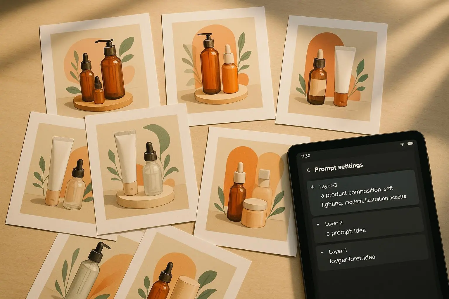
Iteration is your best friend (and your worst critic)
If you’ve ever built a deck or a set of social banners, you know you don’t nail all six images in one go. AI is the same. The trick is to treat each iteration as data, not a finished product.
- Start with a baseline: one prompt, a fixed style, a single aspect ratio.
- Generate 3-5 variants. Each variant tweaks one thing: lighting, angle, texture, or a key subject modifier.
- Compare: which one aligns with your objective? Which one pulls the viewer into the story you’re trying to tell?
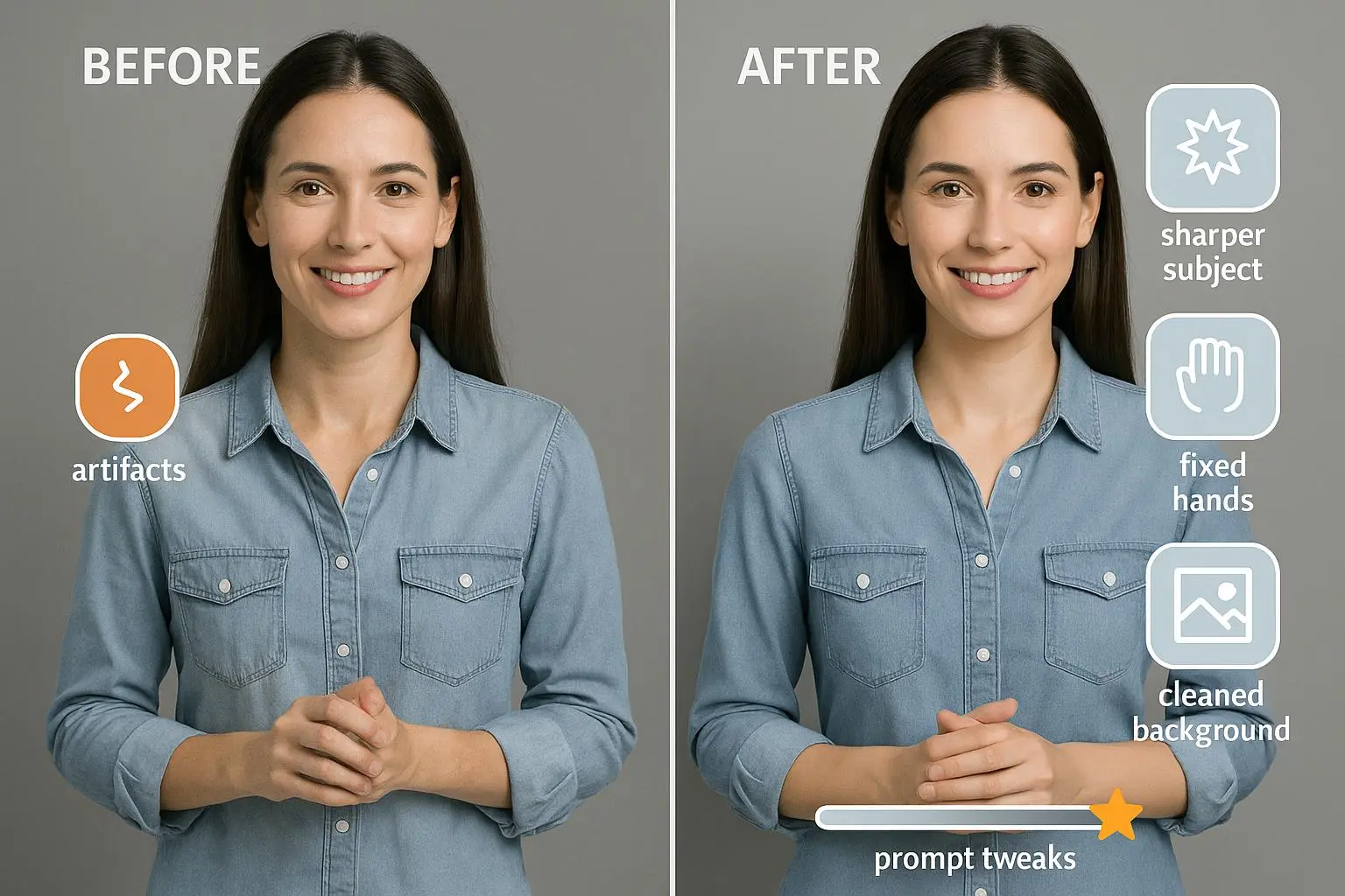
- Refine and upscale: once you’ve got a winner, push it to higher resolution and clean up any artifacts in a light touch with photo-editing software.
Negative prompts can massively reduce stray artifacts. If you keep getting extra fingers or unplanned text on the image, add those negatives into the prompt for the next run. It’s a quality-control lever you’ll thank yourself for.
I once used this approach for a client’s hero image. We started with a realistic photo of a person in a cityscape. The first few attempts looked good, but the composition felt stiff. By iterating—adjusting the subject’s pose, switching to a low-angle shot, and dialing the lighting to a soft dusk— we landed an image that felt dynamic and approachable. It became the header we used for the entire campaign and outperformed the previous visuals by 28% in click-through rate.
A quick aside: I’m always surprised how a small change in perspective changes everything. A 15-degree tilt in the camera angle, or swapping a foreground element for something subtler, can give you a sense of depth you didn’t anticipate.
From idea to publish-ready visuals in hours, not days
What does a fast, reliable workflow look like when you’re juggling blog posts, social content, and client work?
- Prompt discipline: Start with a solid baseline prompt, then add one or two tweaks per variant.
- Style and ratio: Lock a default style and aspect ratio that matches your channel. Save 2-3 “standard” prompts you can reuse.
- Iteration sprint: Generate 3-5 variants quickly. Pick a winner and push quality through upscale and light editing.
- Quick post-processing: Tiny edits in Photoshop, GIMP, or Canva to correct colors, sharpen details, or add text overlays.
- Version control: Save your final image in multiple sizes and file formats. Name them consistently so you don’t hunt them down later.
This isn’t about turning every post into an art piece. It’s about consistency, speed, and quality. The ability to produce visuals on par with professional work without hiring a full-time photographer or designer is what lets you publish with confidence.
I’ve used this workflow across three different projects in the last six months: a weekly newsletter header, a social media carousel, and a client case-study banner. In every case, the time-to-first-draft dropped from hours to minutes, and the final assets felt cohesive with the rest of the brand.
Practical applications: where AI-generated visuals actually shine
- Social media content: Posts with custom visuals get 2-3x engagement versus stock imagery. A small local shop I worked with used AI images for daily posts and shaved weeks off content production while maintaining a unique brand look.
- Blog post headers: A unique header offers a first impression that supports the narrative. It’s not only eye-catching; it can improve time-on-page and perceived authority.
- Marketing materials: Email banners, landing page hero images, and ad creatives can be quickly prototyped and iterated, letting you test multiple visuals in a single campaign.
- Client work: Visual concepts and mood boards can be produced rapidly, accelerating feedback cycles and enabling rapid prototyping.
But it’s not all sunshine. You’ll encounter a few practical realities you should know up front:
- Ethical considerations: Copyright concerns and data sourcing matter. Platforms differ in how they handle training data and rights. Some brands explicitly address licensing and usage rights in their terms.
- Quality variability: Not every prompt will yield a perfect image. Some outputs are clearly experimental. That’s normal. It’s part of learning to steer the AI.
- Dependence on prompts: The better your prompts, the better your results. It’s not magic. It’s craft.
I’ve found that a transparent, honest approach with clients about what AI can and cannot deliver builds trust. If you’re upfront about the process, you can set realistic expectations and still deliver compelling visuals that move ideas forward.
Getting started today: a simple, repeatable plan
If you’re ready to start, here’s a one-week plan you can actually finish.
- Day 1: Pick 2-3 core visuals you want to produce this week (e.g., a blog header, an Instagram post, a hero image for a landing page). Write 2-3 baseline prompts for each, plus 1-2 variations.
- Day 2-3: Generate, iterate, and pick the best version for each asset. Don’t overthink; choose what resonates and keeps the message clear.
- Day 4: Upscale and do light post-processing. Keep the edits minimal—balance sharpness, contrast, and color without overdoing retouching.
- Day 5-6: Implement in your content plan. Use the images in drafts, ask teammates for quick feedback, adjust if needed.
- Day 7: Review performance data. Which visuals performed best? Which prompts yielded the most efficient results? Adjust your baseline prompts accordingly.
A quick note on collaboration: if you’re working with a coder, marketer, or writer, loop them in early. The goal isn’t to replace teamwork but to accelerate it. AI visuals that align with a broader narrative land better than stand-alone images that look great but don’t fit the story.
Common pitfalls (and how to fix them fast)
- Over-prompting: You’ll get muddy results. Solution: pick 3-4 key elements and stay focused on them for each image.
- Under-describing: Generic visuals land flat. Solution: add one or two scene-specific details that tell a story.
- Inconsistent output: Styles drift across assets. Solution: lock a baseline style and aspect ratio for a batch, then only vary the subject slightly.
- Ignoring accessibility: Text overlays and contrast matter. Solution: keep accessible color contrast in mind and avoid cluttered compositions that obscure legibility.
Here’s the thing I learned the hard way: you don’t need to chase every new feature or model to produce great visuals. You need a reliable workflow, a clear brief, and the discipline to iterate quickly. The result isn’t a one-off masterpiece; it’s a repeatable process that keeps your brand consistent and your content fresh.
Real-world voices: what people are saying (and how it helped me)
- “Negative prompts saved my sanity.” – DesignDiva on Reddit. This taught me the value of pruning artifacts before you upscale.
- “It’s like having a thousand artists at my fingertips.” – VisualVoyager on Twitter. The takeaway: variety is a strength if you channel it with intent.
- “I used to spend hours looking for stock photos. Now I generate unique images for my daily posts in minutes.” – BizBoostAI on Facebook. The big win here is time and cost savings, which make scale possible for small teams.
These anecdotes aren’t just nice to hear. They’re signals that the workflow can move from aspiration to reality for people who care about speed, quality, and consistency.
The ethical and practical caveats you should know
- Copyright and licensing: Different tools handle licensing and usage rights differently. If you’re using AI images for a client project, confirm the license terms and whether you can reuse or modify outputs across campaigns.
- Source of data: There’s ongoing debate about where training data comes from and how that affects rights and fair compensation for artists. Be mindful of this as you choose tools and communicate with clients.
- Quality vs. accessibility: A visually stunning image needs to be legible and accessible. Avoid clutter, overly small text overlays, and hard-to-read color palettes.
No single post can solve these debates, but you can stay on the right side of them by being transparent with your clients about your process, the tools you use, and how you handle rights and attribution when appropriate.
Quick-start checklist (yes, you can print this and tape it to your monitor)
- Pick 2-3 core visuals to produce this week.
- Write baseline prompts with 3-4 key elements each.
- Generate 3-5 variants per asset.
- Choose a winner, upscale, and do light post-processing.
- Save assets in multiple sizes and formats.
- Note what works: what prompts, which styles, which ratios.
- Review ethics and licensing for your chosen tools.
If you’re ever unsure, go back to the baseline prompts and the style you’ve committed to. The simplest prompts and consistent styling are the backbone of great, publish-ready visuals.
A quiet note on optimism and curiosity
The landscape around AI image generation is moving fast. New models, new restrictions, new creative possibilities. My stance is simple: stay curious, stay practical, and stay honest with your audience about what AI is doing for you. If you can articulate a clear brief, a strong style you believe in, and a fast iteration cycle, you’ll keep turning out visuals that move readers, viewers, and clients.
That’s the sweet spot I keep returning to: where creativity meets process. When you combine intention with speed, you don’t just produce images—you craft visuals that support a story people want to read, share, and remember.
References
Ready to Optimize Your Dating Profile?
Get the complete step-by-step guide with proven strategies, photo selection tips, and real examples that work.