Getting Started with Text-to-Image Prompts
Jun 8, 2026 • 9 min
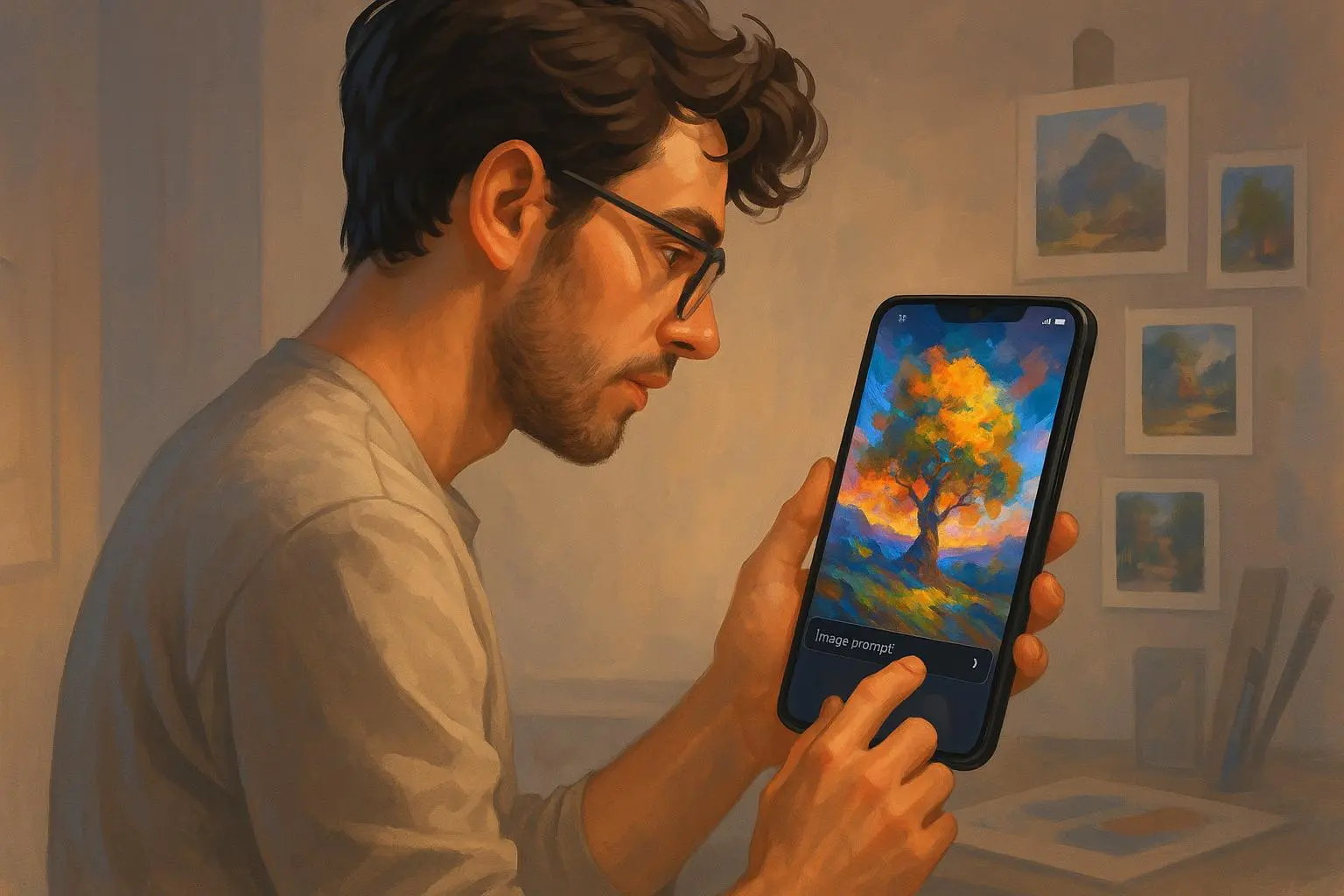
You’re not just asking a machine to draw. You’re writing a scene, directing a camera, and nudging a digital brush toward your exact taste. The idea behind text-to-image prompts isn’t magic; it’s literacy—specifically, the literacy of describing visuals so an AI can translate your words into pixels you actually want to hang on a wall.
I’ve been at this for a while, fumbled through a dozen failed prompts, and watched the same patterns emerge. The good news: you don’t need to be an artist to get surprisingly strong results. The better news: with a simple, repeatable framework, you can level up fast.
Here’s how I approached this the first time I really started getting consistent, high-quality images. And yes, I’ll share a real, messy experiment from my own desk so you can skip the same potholes.
The first truth that saved me: prompts are a recipe, not a paragraph
When I started, I treated prompts like short stories. One sentence, a splash of adjectives, boom—art. It didn’t work. Not even close.
What finally clicked was treating prompts as a recipe with four ingredients. Each part has a job, and you get better results when you respect the order and the balance.
- The Subject and Scene (What and Where)
- The Medium and Style (How it Looks)
- Modifiers and Details (The Polish)
- Parameters (The Machine Language)
If you can explain those four elements clearly, you’ve already got the bones of a strong prompt.
I remember the moment I finally understood this when I prompted a simple scene: “A lone lighthouse on a cliff.” That’s fine as a concept, but the image looked like a silhouette on a gray page. Then I tweaked it into a four-part prompt: the subject and scene, the medium, the mood, and a camera-like instruction. The result: a dramatic, watercolor-style seascape with gold-hour lighting and a crisp, cinematic edge. It wasn’t magic. It was structure.
Here’s a micro-moment that stuck with me: I discovered that the exact words you use in the subject line—“lighthouse on a rocky cliff” versus “lighthouse on a cliff”—changed the perceived drama. One phrase suggested isolation; the other suggested a calm, coastal scene. Tiny choices, big impact.
The anatomy of a high-quality prompt, broken down
Think of a prompt as four layers that work together.
- The Subject and Scene
- Be precise about what you want. If you want a gorilla with attitude, don’t settle for “gorilla.” Try “a stoic silverback gorilla wearing a futuristic helmet, standing on a neon-lit rooftop.” The specificity helps the AI anchor the character and the setting.
- The Medium and Style
- Decide if you want a photograph, painting, digital art, or an illustration. The style should feel like a decision you can defend later. For example, “oil painting, Baroque lighting, textured brushwork” or “cyberpunk digital art with neon glaze.” If you can name an artist or movement you admire, that often acts like a stylistic compass.
- Modifiers and Details
- These are the adjectives and technical cues that tune quality and mood. Think:
- Quality: 8k, highly detailed, cinematic lighting, volumetric light, photorealistic
- Mood: Ethereal, melancholic, vibrant, cyberpunk
- Technical: Depth of field, wide-angle lens, golden ratio
- You don’t need all of them all the time, but a few targeted modifiers can drastically shift the output.
- Parameters (The Machine Language)
- This is where you tell the engine how to behave. Aspect ratio, style weight, sampling steps, and randomness. If you’re aiming for a cinematic shot, you might specify
--ar 21:9. If you want more fidelity and less interpretation, you might go for a “raw” style with fewer stylistic nudges.
I’ve found that starting with a clean blueprint helps a lot. Then you iteratively refine. The real art isn’t in forcing the first image to be perfect; it’s in sharpening the prompt after you see the result.
A practical workflow I actually use
If you want a reliable rhythm, here’s the loop I’ve used for months. It’s simple, repeatable, and it scales from quick social posts to more ambitious art projects.
- Step 1: Concept and Style (the blueprint)
- Write one sentence for the subject and one for the style. Example: “A lighthouse on a rocky coast, watercolor painting.”
- Step 2: Scene and Lighting (context)
- Add the time of day and mood. Example: “at golden hour, dramatic, stormy sea, high detail.”
- Step 3: Polish (modifiers)
- Drop in a few adjectives and a technical cue. Example: “soft watercolor texture, subtle grain, 8k resolution.”
- Step 4: Machine cues (parameters)
- Choose aspect ratio and any style weight. Example: “--ar 16:9 --style raw”
- Step 5: Evaluate, then iterate
- Look at what’s wrong or right. If it’s too dull, push the lighting. If it’s too busy, scale back adjectives. This is where you become precise, not stubborn.
In practice, this means building every image in chunks. If the first go is good but not perfect, I keep the core idea and adjust a few elements rather than starting from scratch. The idea is momentum.
A key insight from the community helped me dial this in: prompts are about directing the camera as much as the subject. It’s not just “what you see,” but “how the viewer experiences it.” A colleague on Reddit pointed out, “I spent an hour trying to get a specific character pose, and it was only when I started adding camera angles and lighting terms that the AI finally understood the mood I was going for.” That’s not fluff—that’s practice talking to machines.
Negative prompting: the quiet but powerful trick
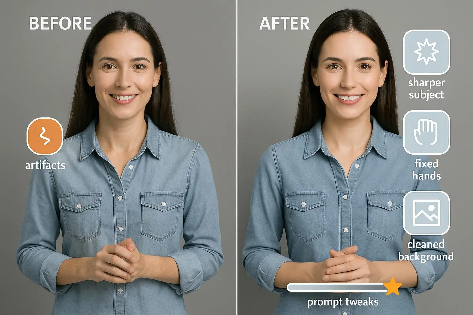
If you aren’t using negative prompts, you’re leaving quality on the table. Negative prompts tell the model what you don’t want. It’s a powerful way to weed out artifacts and unwanted elements before they appear.
Common negative prompts include:
- blurry
- deformed
- text
- watermark
- extra limbs
If faces keep misbehaving or text shows up where you don’t want it, negative prompts are your friend. This is one of those “less is more” moves. You’re guiding output by exclusion as much as inclusion.
I’ve seen a quiet revolution in results when people start applying negative prompts early in their workflow. It feels small to type “no text,” but it saves hours of post-processing and endless re-runs.
Evaluating results: what to look for, beyond “I like it”
As you generate, you’ll develop taste. But there are objective checks you can rely on to avoid the “meh” wall.
- Fidelity to Prompt: Does the image reflect the core elements you asked for? If your subject is a “lighthouse,” is the lighthouse actually present and the right kind of lighthouse?
- Coherence: Do all elements feel natural together, or are there weird artifacts? Look for inconsistent lighting or odd texture transitions.
- Artistic Quality: Regardless of genre, does the composition feel intentional? Strong lighting, believable textures, and thoughtful framing matter more than fancy adjectives.
- Usability: Is the image ready for your intended use? For web use, you’ll want clean edges and proper resolution; for prints, color accuracy and file size matter.
A useful trick: start simple. If your prompt is too loaded with modifiers, you may confuse the model. Try stripping to the essentials, then reintroduce details one by one. This “surgical” approach saves you a lot of guesswork.
Real-world, human story: a stumble turned into a workflow
A few years back, I was producing visuals for a client who wanted a “future-retro city” vibe. I started with a dense prompt—too many stylistic commands and multiple artists named. The first render looked like a collage, not a city. It was loud, busy, and inconsistent.
I paused. I rewrote the prompt into a leaner structure: subject and scene first, “cyberpunk skyline at dusk,” then the medium and mood, “2D digital painting, crisp lines, neon glow.” I added a single, strong reference style to avoid an over-echo of multiple influences. The result was a clean, cohesive cityscape with a believable glow, ready for the banner and social posts.
That single rewrite taught me two things I carry forward:
- Clarity beats cleverness. If your prompt reads like a plan you’d give a junior designer, you’re in the right zone.
- Iteration is your friend, not your enemy. The fastest way to better images is to expect two or three rounds, not one perfect shot.
And a micro-moment from this process: I found that naming the lighting “neon glow” rather than “neon lighting” nudged the software toward a broader, more natural glow rather than sharp neon pins. Subtle, but the output felt more lived-in.
The “minimalist prompt” mindset: can you get quality with fewer words?
Here’s a contrarian thought I keep returning to: you don’t need eight modifiers to get a great image. Sometimes, fewer, sharper words do more work.
Try this approach:
- Pick a single subject and a single strong style.
- Add one or two mood-boosters, not a half-dozen.
- Use a precise aspect ratio and a single, clarifying camera cue if needed.
The idea isn’t to strip artistry; it’s to reduce cognitive load for the model so it can do its best work. If the result isn’t humming, you’re likely adding conflicting signals. In that moment, dial back to a single, clear target and rebuild.
A quick starter prompt you can copy-paste today
- Subject and Scene: “A lone lighthouse on a rocky cliff”
- Medium and Style: “watercolor painting, highly detailed”
- Modifiers: “golden hour, dramatic sky, soft textures”
- Parameters: “--ar 16:9 --style raw”
That’s enough to start, and you can push one piece at a time: lighting, texture, or color balance. In a few iterations you’ll see the mood shift, and you’ll start understanding how each word nudges the image.
The ethical and practical side: respect, realism, and responsibility
As we get better at prompting, we should also get smarter about use cases. AI-generated art is fabulous for concept exploration, marketing visuals, and creative experiments. But it’s worth noting two important boundaries:
- Attribution and consent: If you’re using someone else’s style as a direct input, consider the ethical and legal implications. Acknowledging influences and avoiding misrepresentation is a small thing that goes a long way.
- Realistic expectations: AI shines at certain tasks. It can mimic style and create striking scenes, but it isn’t a substitute for a human artist’s nuanced decision-making in every scenario. Use it as a tool, not a replacement.
A moment I learned this the hard way: I once fell into the trap of chasing a perfect photorealistic look for a client pitch, layering dozens of modifiers and “award-winning” terms. The image ended up feeling contrived, like a product render rather than art. I stepped back, simplified, and the revised prompt finally captured the human warmth we needed to land the concept.
Tools and communities worth watching
- Midjourney: the go-to for high-end artistic cohesion, especially for concept art. If you’re exploring strong stylistic outputs, it’s worth a look.
- Leonardo AI: great for iterative prompting and more control over negative prompts and tiling.
- DALL-E 3: excellent for natural language prompts and text-aware compositions.
And don’t underestimate the value of community. Reddit threads, design forums, and prompt-sharing communities are full of people who’ve tried things you haven’t. The honest, sometimes messy discussions are where you learn the patterns that aren’t in the official docs.
A micro-sample from the crowd that’s helped me: a thread where a user showed how changing one word in a prompt altered the camera angle—and the result suddenly felt cinematic rather than static. It’s amazing how incremental shifts can yield big gains.
How to keep improving without burning out
- Set a baseline prompt for a recurring subject. Use it as your control to compare future iterations.
- Schedule short, focused practice sessions. Ten minutes here, twenty there, repeated over a week beats marathon prompts that exhaust you.
- Maintain a notes document. Record what modifiers you used, the output, what you changed, and why. It becomes your personal cookbook.
- Don’t chase “perfect” immediately. Aim for “better than last time” and let the result compound.
If you’re serious about this, you’ll end up with your own little library of reliable prompts. They won’t be universal magic, but they’ll save you hours and keep you moving toward higher quality faster.
A compact checklist to get you started today
- Define the subject clearly (one sentence).
- Choose a single style and a single mood.
- Add 2–3 precise modifiers (not twenty).
- Pick an aspect ratio that fits your final use.
- Add one or two negative prompts to prune unwanted output.
- Generate, evaluate, and iterate once or twice more.
That’s enough to start producing work you’ll actually want to share.
Why this matters: the promise of prompt literacy
Text-to-image prompts aren’t just a trick for party posts or thumbnails. They’re a new kind of literacy—one that lets you express ideas visually with intention. The better you become at communicating with the model, the more you’ll unlock: faster iterations, higher quality, and a sense that you’re painting with a machine rather than muttering into the void.
I didn’t fall in love with AI art on the first try. It took a lot of failed attempts, a few breakthrough prompts, and the discipline to treat prompting like a craft. Now I routinely turn early drafts into polished visuals that feel both purposeful and alive.
If you’re new to this, give yourself permission to fail a dozen times. Each failure is a tiny tweak in your toolkit. And when you finally land that image you’re proud of, you’ll know you earned it—one clear sentence at a time.
References
Ready to Optimize Your Dating Profile?
Get the complete step-by-step guide with proven strategies, photo selection tips, and real examples that work.