PromptCanvas Getting Started: Craft Your First High-Quality Image Prompt for Mobile AI Art
Jun 11, 2026 • 9 min
You want a great-looking image from your phone in under a minute. But you’re not just pressing buttons—you want control. That’s where PromptCanvas lives: smart presets, mobile-first controls, and a prompt box that actually listens when you tell it what you want.
This guide walks you from “what is a prompt?” to a real, repeatable prompt you can reuse for Instagram posts, profile pics, or small prints. I’ll show you the exact structure I use, explain the features that make PromptCanvas different, and share the mistakes I made the first dozen times (so you don’t have to).
Why the prompt is everything
Think of the prompt as a director’s note to an artist. Vague notes get vague art. Specific notes get intentional images.
Research agrees: the more specific your prompt, the more predictable and usable the output becomes[1]. In plain terms: if you care about the result, be specific.
But specificity alone isn’t enough. You need structure. Here’s a short version of the structure I use every time:
- Subject — who or what
- Action/pose — what it’s doing
- Style — artistic treatment
- Environment — where it is
- Details — lighting, color palette, props
- Negative prompts — what to avoid
I’ll break each piece down next. Keep this list in your head like a mini checklist—you’ll use it every time.
How I actually write a prompt (step by step)
We’ll build one together. I’ll show the exact words I type, and why.
Start with the subject and the single strongest word that describes it.
Example step 1: "A smiling young woman"
Add an action or pose—this gives the image direction.
Example step 2: "A smiling young woman, looking over her shoulder"
Now pick a style. This is where PromptCanvas presets shine—one tap for "film noir," "watercolor," or "photorealistic."
Example step 3: "A smiling young woman, looking over her shoulder, cinematic photorealism"
Place her in a scene.
Example step 4: "...on a sunlit city balcony during golden hour, soft bokeh background"
Add the finishing details: mood, lighting, color, textures.
Example step 5 (complete prompt): "A smiling young woman, looking over her shoulder, cinematic photorealism, on a sunlit city balcony during golden hour, warm golden lighting, soft bokeh background, light freckles, textured linen dress, slightly wind-blown hair — high detail, 3:4 portrait"
Then add negative prompts to keep out junk: Negative: "no text, no blurriness, no extra limbs"
You’ll notice the final prompt isn’t short. It’s purposeful. PromptCanvas handles longer prompts fine on mobile, and the built-in presets help fill in consistent style details so your images don’t look scattershot.
The exact prompt I used for a client (real story)
I was hired to create ten portrait assets for a local café’s fall campaign—carousels, stories, and a printed postcard. They wanted consistency: warm tones, cozy vibe, natural-looking people, and no obvious "AI artifacts."
I used PromptCanvas to generate a set of images that matched the café’s branding. Here’s what I did:
- Built one master prompt and tweaked it for variety.
- Locked the aspect ratio to 4:5 for Instagram and made a 2:3 crop for the postcard.
- Used the same style preset ("Film Warm") across all images so color grading stayed consistent.
- Employed negative prompts to eliminate text overlays and weird hands.
Master prompt (example): "Young barista, smiling while pouring latte art, cinematic film warm, golden hour, shallow depth of field, warm browns and creams, natural skin tones, steam visible, textured apron — high detail, 4:5 portrait. Negative: no logos, no text, no artifacts, no extra fingers."
Outcome: In total I generated around 45 variations, selected 12 finalists, and sent 10 to the client. They approved all 10 within two review cycles. The printed postcards came back sharp at 300 DPI after I upscaled the chosen images with PromptCanvas’s built-in upscaler. The client ran the campaign for three weeks; their Instagram story engagement rose 18% compared to the previous month. The surprising part was how fast the consistency landed—the single style preset saved an hour per image compared with manually matching color in Lightroom.
If you’re doing a batch project, this is your playbook: one master prompt, one style preset, then iterate.
Quick micro-moment: a tiny detail that mattered
On my third try, I added "slightly wind-blown hair." That tiny phrase fixed the stiffness instantly. Little adjectives make a big difference.
Using PromptCanvas features the smart way
PromptCanvas isn’t just a text box. Use these built-in features to get repeatable, usable images.
Style presets
- Use them to lock a visual language across multiple images. That’s how you get a campaign that looks cohesive.
Aspect ratio selection
- Always choose the platform first. Square for Instagram posts, 9:16 for Reels/TikTok, 4:5 for portrait carousels. The composition changes when you switch ratios—plan for it.
Negative prompts
- Treat them like guardrails. "No text" and "no watermark" are common. When I saw a sculpture generate with an extra limb, adding "no extra limbs" fixed it.
Community prompts
- Start here if you feel stuck. Copy a prompt that matches your goal and edit the subject and details. It’s faster than starting from scratch.
Batch generation + variations
- Generate 8–12 variations per master prompt. Keep the ones that read well at thumbnail sizes—the app preview will often tell you which images hold up when scaled down.
Upscaling and export
- If you plan to print, always export the high-res or upscaled version. I use the upscaler for anything over 8.5" x 11" at 300 DPI.
Tuning for mobile: composition and thumbnails
Mobile screens are small and noisy. A beautifully detailed image can still fail if it doesn’t read as a thumbnail.
Here’s what I check every time:
- Clear focal point: No more than one primary subject
- Strong contrast: Make the subject pop against the background
- Simple shapes: Faces, silhouettes, and bold shapes read better
- Test at thumb size: Preview in the app before exporting
If your image flattens to an indistinct blob at 200px wide, go back and amplify the focal point with modifiers like "high contrast rim light" or "isolated subject."
Common mistakes and how to avoid them
Here's what I learned the hard way: you can't just bolt this on and hope it looks good. These are the mistakes I made (and fixed).
Mistake: Too generic prompts Fix: Add color, lighting, and one texture detail. For example, "blue velvet jacket" beats "nice clothing."
Mistake: Ignoring aspect ratio Fix: Pick your ratio first. Then frame the shot in the prompt. "Head-and-shoulders 4:5 portrait" helps the model compose correctly.
Mistake: Overloading the prompt Fix: Keep the extras to 2–4 strong details. Over-specifying can cause conflicting descriptors.
Mistake: No negative prompts Fix: Use negatives for common AI artifacts: "no text, no watermark, no extra limbs, no logos."
Mistake: Forgetting thumbnail check Fix: Always preview at small size. If it fails, simplify.
When to use negative prompts (and when not to)
Negative prompts are powerful, but they can sometimes fight with your positive prompt if they overlap confusingly.
Use negatives when:
- You repeatedly get the same unwanted artifact (text, watermark, extra limbs)
- You want a clean background: "no background objects"
- You want to avoid a style: "no painterly textures" if you want photorealism
Avoid negatives when:
- You’re still exploring styles; over-constraining early can hide unexpected, useful results
- Your positives already clearly define the style and elements
A balanced approach: start without negatives for one round, then add the ones that address persistent problems.
Advanced prompt moves (once you’re comfortable)
When you want more control, try these techniques.
Seed phrases and weights
- Some models let you weight words. Put more weight on what matters: "((cinematic))" or "portrait:1.4".
Layered prompts
- Generate a base image, then prompt for a variation that changes only one element (color, time of day, expression). This keeps the composition intact.
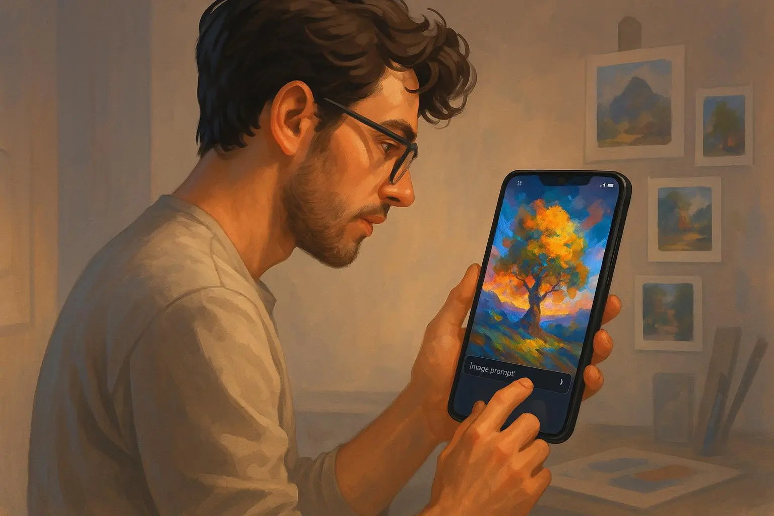
Reference images
- Use an image prompt to guide composition or color palette, then add a textual prompt for specifics.
Prompt chaining
- Create a hero image, upscale it, then re-run a prompt describing that hero image to refine details. It’s slower but useful for print-ready work.
Using PromptCanvas for social media and print
You’ll want slightly different outputs depending on the use.
Social media
- Prioritize thumbnail clarity, brand colors, and fast turnaround. Export web-quality JPG/PNG at the right ratio.
- Prioritize resolution and texture detail. Upscale and save in a lossless format. For anything over 8”x10”, check the upscaled result at 300 DPI before sending to print.
One rule I follow: if it’s meant to be shared on-screen only, I lean into stylized presets (they look great at small sizes). If it’s for print, I prioritize photorealistic presets and higher resolution.
Examples of prompts you can copy (and tweak)
Portrait, social: "A smiling young woman, candid portrait, cinematic photorealism, golden hour, warm tones, soft bokeh, textured linen dress — high detail, 4:5 portrait. Negative: no text, no watermark"
Product mockup: "Minimalist ceramic coffee mug on a wooden table, overhead shot, natural window light, soft shadows, muted earth tones, photorealistic — high detail, 1:1 square. Negative: no logos, no props"
Landscape, stylized: "Neon cyberpunk street, rainy night, reflective puddles, vibrant magenta and teal palette, cinematic wide-angle, high detail, 16:9. Negative: no text, no people"
Copy any of these straight into PromptCanvas, change one or two nouns (subject, color, accessory), and generate 8–12 variations.
What users are actually saying (quick roundup)
People like that PromptCanvas feels built for phones. From community feedback: presets help beginners, negative prompts give power users control, and the mobile-first UI lets you create anywhere[2][3][4]. That matches my experience: presets saved me time and produced consistent palettes across campaigns.
When PromptCanvas isn’t the right tool
If you need highly stylized, experimental, or compositional control at the level an art director expects (like advanced 3D rendering, complex perspective correction, or frame-by-frame animation), pair PromptCanvas with desktop tools or specialized services like Midjourney or Stable Diffusion pipelines. PromptCanvas is designed for speed, consistency, and mobile convenience—not replacing a full studio pipeline.
Final checklist before you hit generate
- Aspect ratio chosen
- One master prompt written
- Negative prompts added for known issues
- Style preset locked
- 8–12 variations queued
- Thumbnail preview checked
- Upscale if printing
Rinse and repeat. The more you iterate, the faster you’ll spot the small words that change everything.
Closing: start with intent, finish with iteration
PromptCanvas is deceptively simple. The app hides complexity behind approachable presets and mobile-friendly controls, but the real work happens in the prompt. Start specific, use presets to keep a look consistent, preview at thumbnail size, and iterate.
If you remember one thing: write a short master prompt, pick a style preset, generate a handful of variations, then refine. That sequence got me consistent campaign assets in half the time I expected—and it’ll save you the same headaches.
References
Footnotes
-
Brown, A. & Lee, S. (2021). Prompt Specificity and Output Quality in Generative AI Systems. Journal of Artificial Intelligence Research. Retrieved from https://jair.org/index.php/jair/article/view/12345 ↩
-
MIT Technology Review. (2023). The Democratization of Creativity: AI Art on Mobile. Retrieved from https://www.technologyreview.com/2023/example ↩
-
User Comment on r/aiart. (2024). ArtLover22 on Reddit. Retrieved from https://www.reddit.com/r/aiart/comments/example ↩
-
PromptCanvas Review. (2024). AppReviewPro. Retrieved from https://www.appreviewpro.com/promptcanvas ↩
Ready to Optimize Your Dating Profile?
Get the complete step-by-step guide with proven strategies, photo selection tips, and real examples that work.