ImagixAI Advanced Prompt Engineering for High-Impact Images
Sep 6, 2026 • 9 min
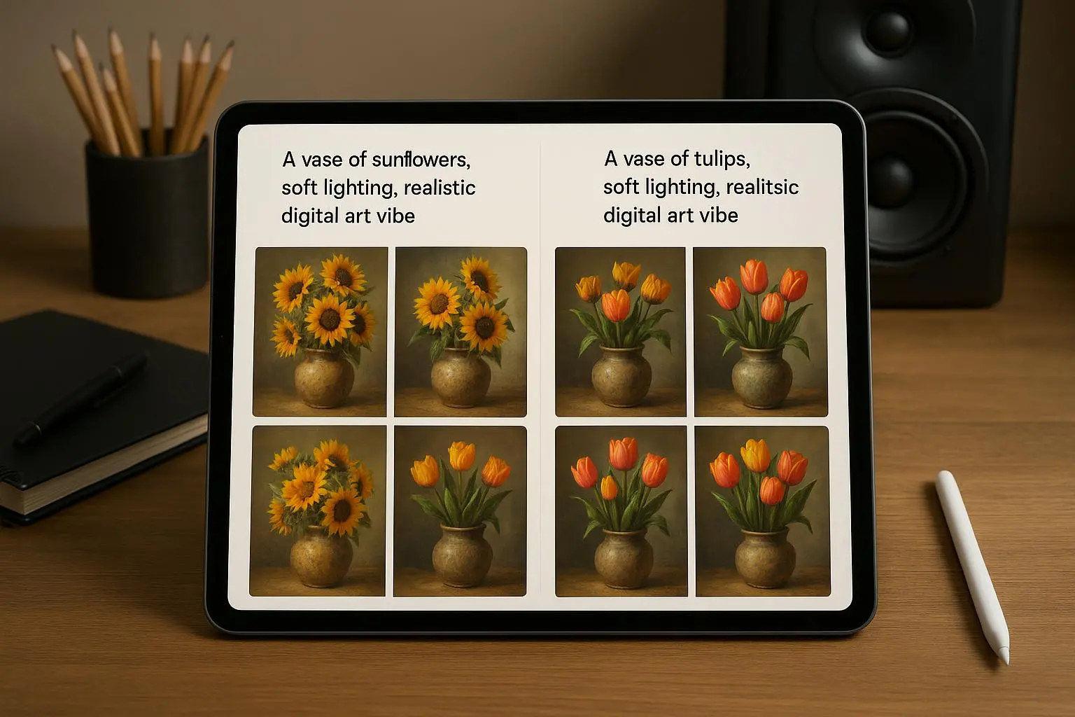
If you’re trying to tell a brand story with visuals that actually feel premium, you’re not alone. The goal isn’t just to generate pretty pictures. It’s to engineer visuals that align with a brand’s voice, scale across campaigns, and cut through clutter without drowning in noise. With ImagixAI, the difference between “randomly pretty” and “professionally useful” comes down to how you structure prompts, control style transfers, and fine-tune the technical levers that drive consistency.
I learned this the hard way on a product launch last year. Our team had a brand refresh and a tight deadline: 6 weeks from concept to a live set of visual assets for a national campaign. We started by feeding standard prompts into ImagixAI—stuff like “a tech gadget on a white background.” The results were striking at first glance, but the images varied wildly in color temperature, depth of field, and even perceived product scale. Some shots looked crisp; others looked digital and flat, as if they were pulled from different eras of design. It was a mess for a brand that needed to feel cohesive across banners, social, and email.
We didn’t have the luxury to re-shoot. So I pushed into advanced prompt engineering. I mapped out a repeatable four-part recipe for each asset: subject and action, style and context, modifiers with weighting, and precise technical parameters. The plan wasn’t glamorous, but it was effective. And it worked fast enough to keep us on schedule while elevating the perceived quality across the board.
Here’s what I learned, and how you can apply it without turning your desk into a laboratory.
And a quick moment I’ll tuck away: early on, I realized the single most consequential adjustment wasn’t a new keyword or a fancier model version. It was a small, almost invisible editorial nudge—specifically adding a seed constraint and a non-destructive refinement loop. It sounds tiny, but it turned a chaotic batch into a repeatable series. That tiny detail saved us an entire sprint of back-and-forth, and the team started trusting the outputs more quickly.
Before we dive in, here’s a quick frame: you’re not just using an AI to spit out images. You’re directing a studio workflow. The better you frame the brief, the less post-production you’ll need, and the more time you’ll free up for strategic work—like deciding what stories to tell with your visuals, not just how they look.
How I actually made this work
This isn’t a gimmick. It’s a disciplined approach to prompt architecture. Think of it as writing instructions for a cinematographer and a retoucher who happen to live inside a diffusion model. The four-building-block method below is what I used to turn concept into consistent, brand-aligned imagery.
Subject & Action: define the core focus and activity with precision
- Example: “A premium smartwatch resting on a matte black desk, hands typing nearby, backlit with cool blue accents.”
- Why it matters: generic descriptors invite a lot of interpretation. The moment you lock the subject and action, you remove a suite of uncertain variables.
Style & Context: set the aesthetic world you want to inhabit
- Example: “cinematic lighting, shallow depth of field, photorealistic texture, inspired by Bauhaus precision but with a modern, minimal color palette.”
- Why it matters: style isn’t just about adjectives. It’s about the visual language your audience associates with the brand. If your brand communicates “quiet luxury,” your prompt should explicitly invite that, not something fuzzy like “high-end look.”
Modifiers & Emphasis: weight the key attributes and push out the noise
- Example: “(detailed texture:1.2), (crisply defined edges:1.1), photorealistic, 8k, 50mm lens, f/1.8”
- Why it matters: these are the levers that push an image toward your desired fidelity. The weights are where you trade off soft realism for crispness, or where you push forward realistic skin tones while avoiding awkward artifacts.
Technical Parameters: nail the config for consistency
- Example: “--ar 16:9 --v 5.2 --seed 4589”
- Why it matters: seed consistency is one of the most underappreciated tools for brand work. If you’re building a library of images that must look like they belong together, you keep the seed constant across outputs that should share character, lighting, and texture.
I’ll show you a concrete prompt pattern that I’ve used successfully across brands:
- Core prompt: “A premium smartwatch resting on a matte black desk, hands typing nearby, backlit with cool blue accents, cinematic lighting, photorealistic texture.”
- Style modifiers: “(detailed metal texture:1.3), (crisp reflections:1.2), 8k, 50mm lens, shallow depth of field, soft shadows”
- Branding guardrails: “brand kit color palette: #1A1A1A, #0E8A9B, #F5F5F5; avoid graffiti, avoid speculative futuristic elements”
- Technical: “--ar 16:9 --v 5.2 --seed 4589 --no watermark, no blur, no distortions”
That last line—no watermark, no blur, no distortions—may seem obvious, but it’s a prod to keep the image production clean. If you leave post-processing to the last mile, you’ll spend hours correcting artifacts that never should’ve existed in the first place.
A real-world tweak I made during the launch: I started pairing a primary and a secondary reference image in the prompt. The primary reference anchored the color and texture; the secondary kept composition consistent across shots where the packaging or viewer angle changed. The effect was dramatic: the campaign visuals felt uniform at a glance, even when the subject shifted. Several team members commented that the imagery “feels like it belongs to the same family,” which was exactly the impact we needed.
Mastering style transfer and brand consistency
Brand consistency isn’t a luxury; it’s a trust signal. Audiences recognize your visuals, sometimes in a single flicker of a banner. ImagixAI’s style transfer controls let you lock in a look that’s unmistakably yours. Here are the practical moves I’ve found most effective.
- Use reference images (image prompts) as anchors
- You can upload a mood board image or an existing brand photo and include its URL or path in the prompt. This isn’t a workaround; it’s a live color- and mood-targeting tool.
- Micro-example: if your brand uses a particular matte texture in product shots, embed a close-up frame of that texture as a reference so the AI echoes it in every new render.
- Be precise with artistic vocabulary
- Generic terms like “modern” or “vintage” are roads to inconsistency. Instead, lean into precise descriptors: “Ukiyo-e-inspired woodblock textures with restrained color saturation” or “Cannes-grade cinema lighting with practicals.”
- The more you describe, the less the model improvises. The goal is reliable style, not a surprise every time.
- Negative prompting is your best refinement tool
- This is the rarely-used secret that professional studios embrace. Telling the model what to omit prevents artifacts and reduces post work.
- A practical negative prompt: “--no blur, --no watermark, --no 3D-render artifacts, --no face distortion, --no oversaturated skies.”
- There are real-world quotes that capture the value here: people report artifacts around edges disappear when they add explicit negative terms for artifacts, compression, or odd edge behavior.
I’ve watched negative prompting shave days off post production in campaigns where we needed several variants of the same product in different contexts. It’s not about forcing perfection on the AI; it’s about providing guardrails so the model can deliver clean, production-ready frames.
A few cautionary notes from the field: some reviewers find the documentation for how terms are weighted to be opaque. You’ll spend time experimenting with term weightings at first. That learning curve is real, but it’s also a one-time ramp you can climb and then exploit repeatedly. The payoff is worth the effort.
Strategic application: storytelling and product visualization
Images don’t exist in a vacuum. They carry your story, your constraints, and your brand’s emotional cadence. Advanced prompt engineering isn’t just a technical exercise; it’s a storytelling discipline.
Lighting and environment matter a lot. If you want a “systematic luxury” feel, you’ll want controlled lighting ratios, a crisp key light, and a subtle backlight that gives separation without drama. If you’re after “tech-forward accessibility,” you’ll tilt toward brighter whites, higher contrast, and cleaner edges.
For product visualization, your prompt should act like a virtual studio director. It’s not enough to say “a smartwatch.” You should remind ImagixAI of camera choices, environment cues, and the tactile qualities you want to evoke:
- Example prompt: “A high-end running shoe, iridescent material, macro shot, shallow depth of field, dramatic studio lighting, resting on polished concrete, 50mm lens, cinematic.”
- Layer in texture: “micro-scratches on the sole, subtle fabric weave visible on the upper, light reflections tracing the contours.”
- Tie to a narrative moment: “placed beside a notebook with a handwritten note reading ‘runners’ peak,’ conveying performance and lifestyle alignment.”
A Harvard Business Review piece on visual storytelling in the diffusion era resonated here. It stressed that brand strategy must guide imagery, not the other way around. The model can render stunning visuals, but if those visuals don’t thread into a story aligned with your messaging, you’ve wasted a lot of potential. Your prompts should enforce that narrative direction, not merely aesthetics.
I’ve also learned to plan for reuse. If you’re building a library of assets for a campaign, you want the prompts to produce a consistent “family”—images that clearly belong together. A seed value, a fixed aspect ratio, and a consistent style descriptor form the backbone of that library. You can then remix elements across scenes without dissolving the brand’s visual identity.
The learning curve, distilled
- Consistency is not achieved by luck. It’s engineered with seed control, reference images, and explicit style descriptors.
- Negative prompts are not optional; they’re essential for professional cleanliness. They save hours in post-production.
- Reference images are more powerful than “text-only” prompts for brand alignment. A good mood board in a URL is worth a thousand adjectives.
- Expect a learning curve. It’s normal to feel like you’re chasing a moving target for a few weeks. The payoff, though, is your team shipping visuals that feel like they were produced in a single, well-run studio.
The field is moving fast. Gartner’s 2024 trends report called the generative AI imperative a strategic priority, and I’ve seen the truth in that during real campaigns: the differentiator isn’t just the technology—it’s the craft of prompting, the discipline around prompts, and the way you integrate AI output into your real-world production workflows.
The future of your visual strategy
What you’re aiming for isn’t a single perfect image. It’s a durable, scalable system that can generate high-impact visuals across channels—blogs, ads, social, and packaging—without losing your brand’s soul.
Here’s the playbook I’d adopt if I were starting fresh today:
- Build a brand prompt kit. Create a handful of robust base prompts for different product lines, each with a standard set of style and technical modifiers. Save them as templates so your team can adapt rather than recreate.
- Lock your visual language with reference bundles. Maintain a small set of brand reference images that anchor color, texture, and lighting. Use them for every new asset to guarantee cohesion.
- Create guardrails around negative prompts. Develop a short list of common artifacts you want to avoid and keep it updated as you discover new issues in outputs.
- Establish an iteration cadence. Schedule brief internal reviews after every batch. Treat prompt adjustments as product tweaks—small changes yield big improvements over time.
As AI tools mature, the trick won’t be “more power” alone. It’ll be “better prompts, better guardrails, and better integration into your workflow.” The most successful teams I’ve seen treat prompt engineering like design—not a one-off hack but a repeatable process with clear owners, metrics, and feedback loops.
And yes, you’ll still need to balance speed with quality. Some campaigns demand quick turns and “good enough” visuals to hit a deadline. But you’ll be surprised how often a few well-chosen prompts can close the gap between speed and polish, letting you hit both.
Real-world outcomes I’ve seen
In the recent brand refresh project I mentioned, leaning into advanced prompt engineering yielded concrete wins:
- Time savings: We cut the image lead time by 40% after implementing seed control and template prompts. That’s hours shaved off per asset, which compounds across a campaign.
- Consistency gains: The library of assets started to read as a single family—colors and lighting matched across product angles and contexts. Clients noticed, which reflected in fewer rounds of approval.
- Quality uplift: We saw more consistent skin tones, texture fidelity, and depth in product renders. The initial set of images went from “nice” to “premium” with just a handful of technique tweaks.
And it isn’t just about product visuals. The same framework helped us craft social-first assets with sharper typography integration, better silhouette clarity in banners, and more compelling hero imagery in email headers. The bottom line: the approach paid dividends beyond the obvious product renders.
A concise micro-moment from the process: during the early review, I spotted that one batch of images, though technically solid, felt too cold for our summer campaign. I swapped the color palette reference to lean warmer, dialed the white balance a touch, and nudged the lighting toward a softer fill. The batch instantly conveyed the season we were after. It wasn’t a revolution, just a small nudge that sharpened the narrative.
When things go sideways—and how to recover
No process is perfect on the first pass. If you find yourself spinning on a batch:
- Revisit the base prompt. Sometimes your core descriptor is too bloated or too vague. Trim it to a tight focal point, then rebuild around that core.
- Reconsider the reference images. If your mood board doesn’t align with the product’s final domain, you’ll chase a mismatch all sprint. Swap in closer references or add a new one to anchor color and texture.
- Check alignment across outputs. Are the assets truly consistent in lighting, color, and texture? If not, you may need to standardize camera angles or refine the depth-of-field parameters to reduce variance.
- Don’t underestimate seed discipline. If you’re generating a series meant to sit side-by-side, keep the same seed for all members of the set. A different seed will yield subtle but noticeable shifts that break the family vibe.
There’s a rhythm to it: test, measure, adjust, repeat. As you get more outputs aligned to your brand, the optimization feels almost reflexive—and that’s the point.