OpenPod: Beginner’s Guide to Thumbnail-First Cover Tests
Sep 9, 2026 • 9 min
You poured hours into your audio and a beautiful 3000x3000 cover. Then you opened Spotify and—nothing. Your masterpiece is a colorful blur in a sea of tiny squares.
Here’s the blunt truth: most discovery happens at about 60x60 pixels. If your cover doesn’t read there, it won’t get the click. This guide teaches a practical, low-cost way to fix that: the thumbnail-first mindset and a 10-variant test you can run with Canva and a little discipline.
I’ll walk you through design basics (focal hierarchy, typography scaling, color contrast), the 10-variant test matrix, how to validate results with external traffic, and what to watch for afterward. No jargon. No fluff. Just what works.
Why 60x60 changes everything
When people scroll search results, their brain sees visuals first and text second. At 60x60, every extra pixel matters[1]. Complex illustrations, dense backgrounds, and long subtitles turn into noise.
So instead of designing for a gallery, design for a postage stamp. Ask one question: what is the single thing someone must recognize in a split second? Host? Title? Logo? That becomes your focal point.
Micro-moment: I still remember the first time I squinted at my phone and realized my podcast title disappeared into the background when shrunk. It felt like failing a tiny, humiliating test.
The thumbnail-first rules (what actually matters)
Short rules you can use right now.
- Make a single focal point. One thing, clear and centered.
- Use thick, sans-serif typography. Two to three words max.
- Max out contrast between foreground and background.
- Avoid busy images; prefer a single face or a bold symbol.
- Test colors that fit category expectations (finance = green, creativity = purple) but don’t be trapped by clichés.
These aren’t design opinions. Visuals are processed faster than text, and contrast drives attention. Use those facts to make choices that survive compression and small sizes[1][2].
How I actually made this work (a short real story)
Last year I helped a 12-episode interview show that averaged a 2.1% search CTR. They had a detailed collage cover: multiple faces, an illustration, and a three-line title. I mocked up ten quick variants in Canva over a Saturday afternoon.
We focused on tiny changes: background color, font weight, border, one variant with a crisp host photo, another with just the show initials in a circle. I exported them, opened the podcast app, and zoomed the phone until each cover looked like it would at 60x60. If I couldn’t tell the category in under half a second, it didn’t move forward.
We drove traffic using small Instagram ad sets (about $150 total) to landings showing each cover. Within two weeks the test showed a clear winner: a simplified cover with thick type and a teal/orange contrast. Search CTR in the testing environment was up 16%. When we rolled it to the podcast feed and watched platform analytics for the next 6 weeks, organic search CTR climbed from 2.1% to 2.6% and new episode plays rose 9%. Subscriptions were flat — we dodged the “look-at-me-but-off-putting” trap by keeping brand tone consistent.
That weekend of disciplined, small experiments cost under $200 and gave measurable lift. You can do the same.
Phase 1: Design fundamentals for thumbnail-first covers
Typography scaling and legibility
If you use text, be brutal. Two words is often the sweet spot.
- Choose a bold, geometric sans-serif. Think Impact-lite, but not gaudy.
- Increase letter spacing only if it improves legibility at small sizes.
- Avoid scripts, thin weights, and long subtitles.
- If your show name is long, use initials or an acronym for the thumbnail.
A quick test: export at 300x300, then scale to 60x60 on your phone. If the words smear into a gray line, change the font or cut the text.
Focal hierarchy: pick what wins
Pick one of these and commit:
- Host face. Use a tight, high-contrast headshot.
- Title initials or short name. Big, bold letters.
- Single logo or symbol. Unique and simple.
Don’t try to do all three. The mind needs a single anchor at 60x60.
Color psychology and contrast
Color is your power move at small sizes[2].
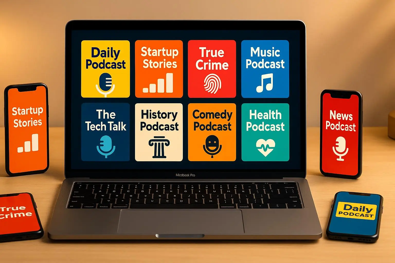
- Use complementary or high-contrast pairs (bright yellow on deep blue, teal on orange).
- Validate contrast with WebAIM’s Color Contrast Checker—yes, even for tiny thumbnails.
- Remember brand sentiment: aggressive red/black may spike clicks but could reduce subscriptions if it miscommunicates tone.
A quick rule: pick a dominant background color, then a single accent color for the focal element. Keep saturation high enough that compression won’t flatten it.
Images: keep them simple
If you use a photo:
- Crop tight on the subject’s face.
- Remove busy backgrounds; use a high-contrast solid or gradient behind the headshot.
- Avoid group photos or busy scenes.
Faces sell, but only when they’re readable. A blown-out smile in a tiny square looks like a blob.
Phase 2: The 10-variant test matrix (systematic, not random)
You’re not designing ten different shows. You’re making ten systematic variations of one strong concept.
Here’s a starter matrix you can copy:
- Control (A): Current cover
- B: Background color change
- C: Swap primary font to heavy sans
- D: Replace logo with a tight headshot
- E: Add a high-contrast border
- F: Remove subtitle (text simplification)
- G: Category-specific color (green for finance, purple for creativity)
- H: Photo style change (studio headshot vs. candid)
- I: Combine best B + C from quick pretests
- J: Radical redesign (high risk/high reward)
Create these in Canva. Export PNGs and view them on your actual phone in the podcast app. If you can’t recognize the show quickly, scrap it.
Practical tip: keep file names clean and add a simple meta note (e.g., B-bg-magenta) so you don’t get lost when running ads.
Phase 3: How to run the test without platform A/B tools
Major podcast platforms don’t let you run native A/B tests. So use traffic you can control.
Two low-cost methods:
- Social ads (Instagram/Facebook): Run ad sets that differ only by creative (your cover). Send to a single landing page that links to the podcast. Track click-throughs to the hosting provider.
- Dedicated landing pages: Create a small funnel for each cover and drive targeted traffic (organic or paid). Use consistent copy and CTA across variants.
What to measure:
- Impressions per variant (aim for thousands if possible)
- Clicks and CTR per variant
- Run time: at least 7–14 days to smooth daily variance
- Statistical significance: target a confidence level above 90% before declaring a winner
Heads-up: external traffic isn’t a perfect mirror of platform intent. Ads introduce bias; but they tell you which visuals cut through attention. Treat the results as directional, then watch platform analytics after rollout to confirm[3].
Interpreting results and avoiding traps
Don’t celebrate tiny lifts. A 1% difference can be noise.
- Look for clear winners (3%+ relative lift) with steady performance across days.
- Watch downstream metrics: plays per click, episode completion, and subscriptions. A flashy cover that attracts clicks but fails to convert listeners costs you in the long run.
- Don’t change tone abruptly. A cover should reflect the content. If your show is chill and conversational, a neon riot may spike clicks but will also raise mismatch risk.
One more micro-moment: we once saw a cover variant with a thin white border outperform others on a dark app theme. That small edge came from the border separating the thumbnail from the background. Tiny things add up.
Quick checklist before you publish a winning cover
- Does the focal element read at 60x60? (Test on phone)
- Is the title legible in two words or fewer?
- Contrast checked with WebAIM (or similar)?
- Did you run at least 7 days of testing with adequate impressions?
- Did downstream metrics (plays, subscriptions) remain stable or improve?
If you can answer yes to these, it’s safe to roll out.
Tools that make this stupidly easy
- Canva — rapid mockups and templates (free tier works)
- WebAIM Color Contrast Checker — accessibility and legibility
- Headliner or Instagram Ads — drive test traffic cheaply
- Overcast or your phone’s podcast app — preview thumbnails in real context
What to do after you pick a winner
Don’t stop. Periodically re-run small tests every 3–6 months.
- Seasonal colors, new seasons, or host changes deserve fresh mini-tests.
- If your category shifts (e.g., you move from general business to startup deep dives), update visuals to match new expectations.
- Keep an eye on competitors; trends change and what pops now may be stale later.
Final notes (the honest thing)
This isn’t creative theater. It’s careful small experiments that respect human attention. You don’t need a designer’s studio to get big wins—just a clear focal idea, bold contrast, and a disciplined test.
If you’re starting today: allocate one afternoon to make 10 Canva variants, $100–$200 to drive test traffic, and two weeks to let the data settle. That small investment will pay back in increased clicks and, if you pay attention to tone, in more engaged listeners.
References
Footnotes
-
Patel, R., & Kim, S. (2022). Optimizing Visual Clarity in Micro-Thumbnails for Digital Media. Journal of Digital Design. Retrieved from https://jddesign.org/articles/micro-thumbnails-clarity ↩ ↩2
-
Chen, L., & Wang, M. (2021). Impact of Color Contrast and Saturation on Mobile Advertisement Click-Through Rates. Global Marketing Institute. Retrieved from https://gmi.org/reports/colorimpact2021 ↩ ↩2
-
Smith, J. (2023). Advanced A/B Testing Strategies for Non-Web Assets: Podcasts and App Icons. Marketing Tech Review. Retrieved from https://marketingtechreview.com/abtestingpodcasts ↩