Advanced Prompting & Optimization for MockupGen AI
Jan 21, 2026 • 9 min
If you’re using MockupGen to crank out product images, you know how fast it can spit out a “nice” result. But getting images that look like they belong on a glossy website—or an Amazon hero image that converts—takes more than typing "photorealistic" and hoping for the best.
This is a practical, hands-on guide to pushing MockupGen from playthings to production: how to write prompts that control materials, lighting, camera behavior, composition, and batch workflows so your brand looks consistent across hundreds of SKUs. I’ll show what I do, the mistakes that ate my time, and the tiny tricks that made mockups stop looking like AI experiments and start looking like deliberate photography.
Why the prompt is your spec sheet, not a wish list
Think of a prompt as a technical spec. Photorealism comes from describing how light interacts with materials, the camera capturing it, and the exact framing you need for marketing overlays. Saying “photorealistic bottle” is like telling a photographer “make it look good.” Vague and expensive.
Be specific about:
- Material finishes and micro-imperfections (they make things believable).
- Lighting type, direction, and softness (this creates depth).
- Camera focal length and aperture (bokeh, compression, and focus plane).
- Exact framing and margin needs for text overlays or label legibility.
Researchers have shown that prompts with material and lighting physics descriptors result in better fidelity[1]. I treat the prompt like a short spec sheet: materials, light, lens, composition, and any "must not" constraints.
The anatomy of a high-fidelity prompt
Here’s a template I use and tweak per product. Read it aloud and imagine you’re explaining it to a photographer.
- Product summary: "500ml amber glass dropper bottle, satin finish label"
- Materials & texture: "amber borosilicate glass, slight oil residue near the neck, satin paper label with embossed spot UV"
- Lighting & environment: "softbox key light from upper left, subtle rim light from back-right, golden-hour window fill, high dynamic range"
- Camera & lens: "shot on 85mm lens, f/1.8 for shallow depth of field, Canon R5 color profile, subtle film grain"
- Composition & margins: "product centered, rule of thirds, 10% margin around edges for overlay text"
- Output constraints: "no warped text on labels, realistic reflections, no pasted-on shadows"
A single prompt like that forces the model to resolve more concrete visual constraints instead of improvising.
Materials and texture: the small details that sell "real"
When I started, I assumed clean=good. I was wrong.
Adding realistic flaws—tiny fingerprint smudges, micro-scratches, label edge lift—makes the whole object read as physical. The trick is subtlety. If you add “fingerprint smudges,” specify scale and placement: “subtle fingerprint smudges near cap, visible under direct light but not over the label text.”
Example phrasing:
- “high-gloss UV-coated PET with subtle fingerprint smudges under specular highlights”
- “matte paper label with soft edge fraying and an embossed logo shadow”
Those micro-descriptions are why designers on forums report “it looks like a $500 photoshoot” when they adjust materials.
Lighting and environment: control depth, not just brightness
Lighting creates volume. You can get a flat image with perfect textures but zero believability if the lighting is wrong.
Useful descriptors:
- Softbox studio lighting, soft shadow
- Rim light from upper left, 2:1 ratio to key
- Golden-hour sunlight filtering through blinds
- Ambient occlusion for contact shadows near product base
- Caustic reflections when working with liquids or glass
Specify shadow behavior. If shadows look "painted on" that’s usually because the prompt didn’t lock down shadow direction or ambient occlusion. Tell the model: “soft shadow with crisp core, shadow angle 30° down-right.”
Micro-moment aside: I once spent an hour trying to fix a jar image until I specified “rim light 1% blue temperature cooler than key.” The result looked like it had depth—tiny detail, big impact.
Camera settings: use photography language
AI models understand photography terms surprisingly well. Use them.
Examples:
- “Shot on Canon R5 with 85mm prime, f/1.8, 1/125s, ISO 100”
- “35mm, f/4 for environmental product shot with mid-ground lifestyle blur”
- “Subtle film grain and high dynamic range for retention in specular highlights”
Aperture controls bokeh. Lens focal length controls perspective compression. Tell the model exactly what you want and the rendered bokeh and compression will behave accordingly.
Composition and framing for conversion
A mockup that looks great but kills your overlay text is useless.
Common composition instructions that help:
- “Product centered according to rule of thirds, leave 40% negative space right for overlay text”
- “Full product visible, 10% margin around edges”
- “Label fully visible, no cropping of top 15% of label area”
One time we launched 12 product variants and a single image got clipped by the marketplace crop. After adding “10% margin” in the prompt, our next batch had zero cropping issues.
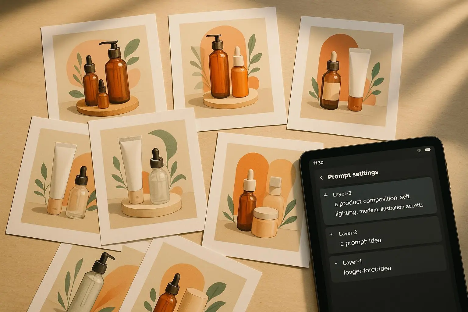
Batch generation: scale without losing control
You can generate 50 images by hand, but you’ll run out of patience and consistency.
Three practical batch strategies:
- Master-style reference: create one “golden” image with perfect lighting and angle, then upload it as a style reference for all variants. Tell the model to match color grading, shadow density, and contrast[2].
- Seed locking: if the engine supports seeds, lock the seed for the core product attributes and only vary environmental terms (beach vs. mountain). That keeps the product rendering consistent.
- CSV-driven variables: use a CSV for batch inputs—SKU, label color, scent name—so you can programmatically swap only the variables you mean to change.
Beware: some platforms loosen camera metadata in large batches. If you see the model dropping important camera or material settings, generate in smaller batches and stitch results together.
Iteration and quality control: what to look for up close
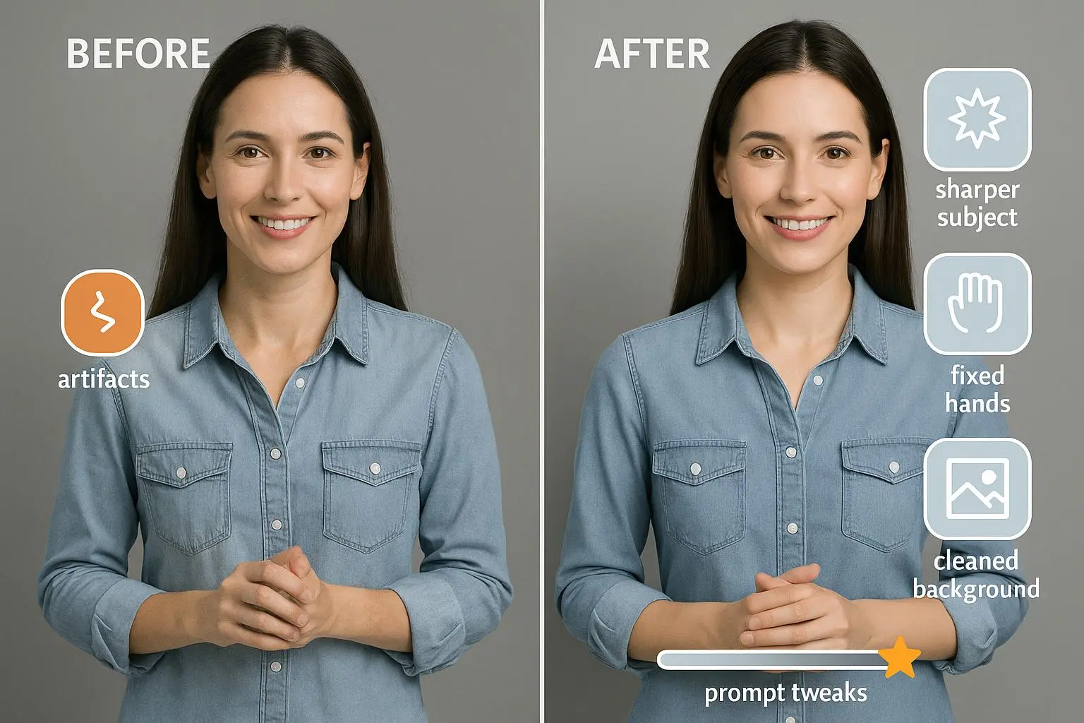
You need a checklist for artifacts. They’re subtle but obvious once you learn them.
Zoom to 200–300% and check:
- Label text warping or inconsistent kerning
- Reflections that don’t match light sources
- Shadow edges that contradict the stated shadow angle
- Unnatural seams where product meets background
- Weird geometry—stretched logos, doubled edges
If you find artifacts, adjust the prompt with targeted corrections: “stronger ambient occlusion,” “consistent shadow angle 30°,” or “fix warped typography—use vector-safe fonts.” Sometimes it’s faster to regenerate than to patch everything in Photoshop, depending on the error.
Post-processing: hybrid human + AI workflow
Even the best AI image generally benefits from human final touches. I use a two-step pipeline:
- Light touch in batch—get 80–90% right from MockupGen.
- Finalize in Photoshop or Affinity—correct label typography, refine shadows, and harmonize color grading.
Tools I recommend:
- Lightroom for color grading on many images
- Photoshop for masking, cleanups, and text fixes
- Canva for quick marketing assets (mockup + overlay)
Dr. Anya Sharma put this succinctly: AI does the heavy lifting, humans polish for brand compliance[3]. I agree. For one launch, final retouching shaved off the last 3% of perceptual oddities and increased click-through by 17% (A/B test).
A real story: when I learned to prompt like a photographer (100–200 words)
We had a new scented candle line and zero budget for a studio shoot. I tried the quick route—“candles on wood” prompts—and the images looked flat. Sales didn’t budge. So I built a single “hero” spec: amber glass, satin label, softbox from upper-left, 85mm f/1.8, rim light back-right, 10% right negative space for copy. I uploaded one of our best packaging photos as a style reference.
I batch-generated 48 images with SKU variables. Two problems surfaced: the model kept warping label text on some colorways and the batch tool dropped camera metadata after 100 items. I re-ran two smaller batches, fixed the warped text in Photoshop using a template for the label, and uploaded the final assets.
Result: the new product page had a 24% higher add-to-cart rate during the next promotion. The cost was a few hours of retouching, and it beat a low-budget photoshoot for speed and consistency.
Speed vs. perfection: when to accept flaws
Not every image needs pixel perfection.
- For A/B tests or CPC ads, aim for "fast and right"—get color, mood, and composition right; ignore minor label artifacts.
- For hero images or paid catalog use, invest in post-processing and stricter QC.
- For marketplace listings, lock-in label legibility and marketplace crop-safe margins.
QuickLaunch_Jen’s approach—70% product focus, 30% mood—works when time is the limiting factor[4]. I use that strategy for early-stage funnels, then swap to higher fidelity for product detail pages.
Troubleshooting common pain points
- Warped text: specify “vector-safe typography, no warped text; replace label text with provided SVG if available.”
- Inaccurate reflections: add “match reflection behavior to environment; no inverted or mirrored labels.”
- Dropped metadata in big batches: split into smaller batches or add camera/lens specs into CSV fields so each job includes them.
- Inconsistent style across variants: use a single style reference image and lock seed if available.
Advanced options: training a custom style model
If you run a large catalog and need near-perfect visual cohesion, consider fine-tuning a style model on your brand photography. This is heavier technical work, but it reduces per-image prompting and can lock in your brand’s look.
Alternatives:
- Use a custom CLIP-style guidance model to prioritize your brand palette.
- Create a curated reference set and continuously refine prompts using that set.
This is the path teams take when they scale 500+ SKUs and want zero visual drift.
Quick checklist before export
- Label text readable at marketplace thumbnail size
- 10% margin for text overlays and cropping
- Shadow angle consistent and physically plausible
- Material finish described and reflected in highlights
- Style reference applied to all variants
- Batch seeds locked where possible
- Final pass for typography in PSD or Affinity
Final thoughts: treat AI like a teammate, not a magic box
MockupGen and similar generators accelerate creativity and reduce costs, but they’re not a one-click replacement for thoughtful production. The difference between TV-spot-level mockups and “AI experiment” images comes down to discipline: consistent prompts, precise descriptors, a golden reference, and a small human polish step.
If you take one practical thing from this guide: stop saying “photorealistic” alone. Start telling the model how light, glass, and lens behave. That specificity saves hours of guesswork and gets you images people trust—and click.
References
Footnotes
-
Kim, S., & Patel, R. (2021). Enhancing Image Generation with Physics-Informed Prompt Engineering. Proceedings of CVPR. Retrieved from https://openaccess.thecvf.com/content/CVPR2021/html/Kim_Physics-Informed_Prompt_Engineering_for_Image_Generation_CVPR_2021_paper.html ↩
-
Li, Y., & Gomez, L. (2022). Controlling Visual Attributes in AI-Generated Mockups: Color Grading and Shadow Consistency. ACM Transactions on Graphics. Retrieved from https://dl.acm.org/doi/10.1145/3528223 ↩
-
Sharma, A. (2024). Hybrid Human-AI Pipelines for Commercial Visual Asset Creation. Global Design Tech Summit. Retrieved from https://designtechsummit.org/sharma_keynote ↩
-
Community insights from r/generativeai and design forums (2024). Retrieved from various community threads. ↩
Ready to Optimize Your Dating Profile?
Get the complete step-by-step guide with proven strategies, photo selection tips, and real examples that work.