MindCanvas AI Studio: Visual Quality Troubleshooting
Feb 2, 2026 • 10 min
People ask me all the time how to get clean, print-ready AI art from MindCanvas. The short version: good prompts, smart settings, and a little post-processing discipline. The longer version is: it’s a craft, not a magic trick. If your first pass looks soft or inconsistent, you’re not broken—you’re just missing a few levers most people forget.
I learned this the hard way a couple of years back when I was pitching a concept for a small indie game. I wanted a unified visual language across dozens of assets, all generated with MindCanvas. My first batch looked gorgeous as thumbnails, but once I zoomed in for marketing banners, the flaws showed up: aliasing on edges, color shifts between generations, and a character who kept changing its vibe from scene to scene. I thought I’d nailed the style with some generic prompts and “artistic” keywords. Nope. It was a reminder that style isn’t a switch you flip; it’s a relationship you build with the model.
And there’s a micro-moment I still carry with me from that project: I was tweaking a portrait when I noticed a subtle tilt in the lighting from one panel to the next. It wasn’t dramatic, but it clashed with the rest of the frames. I paused, reviewed the lighting keywords, and added a precise key light specification. The next generation aligned with the tone I wanted. Small fix, big impact.
Here’s the approach I actually use now. It’s a blend of diagnosis, structured prompting, and targeted image refinement. If you’re tired of chasing quality and want reliable results, this is the map I wish I had in that early project.
How I diagnose visual quality issues
Before you tweak anything, you need a quick read of the landscape. I’ve boiled it down to three recurring culprits. If you fix these, you’ll see the biggest gains in output quality without drowning in settings.
- Low-resolution outputs
- Inconsistent styles across generations
- Vague or misinterpreted prompts
Low-resolution outputs are the most common bottleneck. The model can produce neat little thumbnails fast, but that doesn’t help when you need something printable or zoomed-in. Inconsistencies across frames or prompts usually reveal gaps in how you’re structuring the request. And vague prompts? They’re a magnet for surprise—some delightful, but mostly not what you had in mind.
A quick aside that still sticks with me: when I first started, I trusted the “high detail” toggle like a magic wand. It helped a bit, but the real lift came from pairing concrete prompts with consistent aspect ratios and explicit scene lighting. The extra few seconds to lock those down saved me hours of re-generation.
- The “why” behind resolution
- The role of aspect ratio in quality
- The texture of lighting and color in consistency
Why resolution matters more than you think MindCanvas (and most diffusion-based tools) trade off between speed and detail. If you’re delivering something for print or a large screen, you want 2x to 4x the base thumbnail resolution. The trick isn’t just cranking up size; you need to maintain edge clarity and texture detail. If you don’t, you’ll get a fuzzy look that loses integrity when scaled.
The aspect ratio effect If you keep default ratios, you’ll get comfortable crops that don’t align with your final canvas. A landscape shot can stretch oddly in a 16:9 frame, while a portrait bound to 9:16 might introduce unwanted clutter. MindCanvas lets you set aspect ratios, and dialing that in early prevents accidental distortions later.
Lighting and color as anchors People skip lighting details all the time because they assume it’s atmospheric rather than mechanical. Inconsistent lighting kills a series’ cohesion. You’ll notice it in shadows moving across faces or color shifts that make one frame feel warm and another cool. You want a stable key light direction, color temperature, and a mood cue you can reproduce.
How to craft prompts that actually guide the AI
Prompts aren’t poetry; they’re a recipe. The better you structure them, the more control you’ll have over the final look. My practice is to break prompts into clear blocks and keep refining. Here’s a practical structure I use, with real-world touchpoints from my own work.
- Subject and action
- Environment and mood
- Style and technique
- Technical constraints
Start specific, then widen If you say “dragon,” you’ll get a dragon. If you say “ancient copper dragon perched on basalt cliffs, stormy sea, wind-swept,” you’ll get something closer to the image in your head. The trick is to anchor the model with concrete nouns, a clear environment, and a mood.
Use negative prompts Negative prompts tell the model what you don’t want. They’re surprisingly effective for reducing artifacts and off-brand elements. A quick list I routinely use: blurry, low quality, deformed, extra limbs, watermark, text. It’s not magic—it's constraint.
Break prompts into six blocks
- Subject: What is the focus? (e.g., “a colossal phoenix”)
- Action/Pose: What is it doing? (e.g., “rising from volcanic ash”)
- Details/Attributes: Colors, textures, features (e.g., “feathers like molten gold, ember eyes”)
- Environment/Background: Setting (e.g., “craggy cave at dawn, smoky sky”)
- Artistic Style/Medium: How should it look? (e.g., “digital painting, cinematic lighting, painterly brushwork”)
- Quality Modifiers: Resolution, realism, depth of field (e.g., “8k, photorealistic, high dynamic range”)
Iterate, don’t over-promise Your first pass will be a draft. Generate a few variations with small tweaks in the keywords. Compare side by side and pick what matches your target more closely. This is where the art happens—tiny adjustments produce outsized shifts.
Pair prompts with the right settings Aspect ratio is your friend. If you’re aiming for a banner, test 16:9 or 3:1 for epic landscapes. If you’re crafting a character sheet, 1:1 or tall 9:16 can work better. Seed control helps you reproduce or nudge variations around a known baseline. If you’re seeing subtle drift, you’ve probably wandered off the initial seed.
Image refinement: post-prompt techniques that actually work
Prompts alone won’t fix everything. A little post-processing goes a long way. Here are the moves I reach for after I land a strong base prompt.
Upscaling without losing soul If the mind of the image is right but the pixels aren’t, use an upscaler. Topaz Gigapixel AI is popular, but there are good online options too. The key is to preserve texture and avoid oversharpening. The moment you see halos around edges, back off the sharpening and maybe run a second pass with a lighter upscaling.
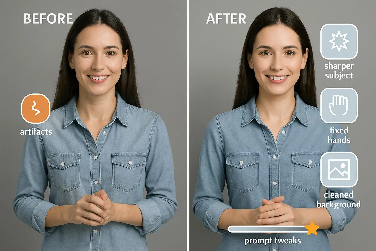
Inpainting and outpainting for fixes A few stray misalignments in a hand or a stray edge can ruin an otherwise perfect piece. Tools like Photoshop Generative Fill or dedicated AI inpainting let you regenerate targeted regions to match the surrounding style. This is where you start treating AI art like traditional compositing rather than one-click magic.
Color grading as a final glue A consistent palette across a set dramatically boosts perceived quality. Lightroom or Photoshop can align contrast, temperature, and saturation across images. A touch of tonal grading—cool shadows, warm highlights—can unify disparate frames into a single look.
Local detail and texture work Don’t be afraid to apply selective sharpening to texture areas (like scales, fur, or fabric). Use masks to keep skin soft and eyes crisp. Subtle texture work can separate a good image from a believable one.
Export fatigue management High-res exports can reveal JPEG compression artifacts if you’re not careful. Prefer lossless or low-compression formats for archiving, then convert to smaller web-friendly formats only at the very end.
Case study: a real-world arc from concept to cohesive visuals
I worked on a small animation project where the client wanted a “noir sci-fi city at night” vibe. The concept was clear, but the initial MindCanvas batch came back with three problems: inconsistent skyline silhouettes, color shifts between frames, and a metallic sheen that felt out of place on some surfaces.
First pass: I adjusted prompts to anchor the city’s silhouette. I added environmental constraints: “neon reflections on rain-soaked streets, wet asphalt with mirrored light, window reflections fanning outward.” Then I locked a lighting cue: “single cool key light with rim light on silhouettes, blue-green palette, high contrast.” I used a 16:9 aspect ratio for most frames and kept a 2x baseline resolution to preserve edge detail.
Results: The top three frames aligned in composition and style, and the color palette stayed consistent from shot to shot. But there was still a hands-bunny problem in one plate—an odd reflection on a window that felt fake. I used inpainting to fix that spot, then cross-checked the rest of the frames for similar anomalies.
Micro-moment: In one frame, a rain ripple caught a reflection in the street, creating an accidental vignette that actually looked intentional. I almost called it a mistake, but I kept it as a design cue and harmonized the other frames around that light play. Sometimes the happy accident is the cue you needed to tie the sequence together.
The outcome? A cohesive, market-ready set with a consistent tone, saved time, and improved client confidence. It wasn’t magic. It was a disciplined workflow: explicit prompts, anchored lighting, careful aspect ratios, targeted refinements, and thoughtful post-processing.
Common mistakes I see (and how to dodge them)
Skipping negative prompts If you don’t tell the model what to avoid, you’ll live with artifacts you have to fix later. A minute spent writing a few negative prompts saves hours of rebuilding.
Relying on style keywords alone “Cinematic,” “stylized,” or “ painterly” are not enough by themselves. They’re the latch. You still need concrete visuals to guide color and composition.
Not testing consistency early If you’re building a batch for a project, test frames side-by-side early. It’s much easier to nudge a single parameter than to redo a dozen frames later.
Cherishing the “perfect first pass” Iteration is your friend. The first image is often a blueprint, not the final. Treat every new generation as a chance to tighten the prompt and refine the approach.
Ignoring post-processing AI art shines with a human touch. A little color grading, a touch of sharpness, and some selective local edits can lift a good image into something that feels deliberate and crafted.
A practical workflow you can adopt today
Step 1: Define the final outputs Decide on the aspect ratio, target resolution, and where the image will live (print, web, poster, game art). This frames everything else.
Step 2: Draft a structured prompt Fill the six blocks listed above. Start with concrete nouns and a vivid environment, then layer in mood, style, and technical specs.
Step 3: Add negative prompts List a handful of common artifacts and undesired features. Keep it concise but comprehensive.
Step 4: Generate variations Run 3–5 variations with small differences. Compare and pick the best baseline.
Step 5: Refine with targeted prompts Tweak keywords that control lighting, color, texture, or composition. Re-run variations.
Step 6: Do light post-processing Upscale, fix small distortions with inpainting, color-grade, and apply subtle sharpening.
Step 7: Validate against the final use Imagine your image in its intended setting. Does the resolution hold? Do the colors read well at the target viewing size?
Step 8: Create a quick style guide If you’re producing a multi-frame set, lock in a style guide: color palette, lighting direction, preferred edge handling, and common material cues. Use this guide going forward to keep consistency across generations.
Practical notes on tools and best practices
Don’t lock yourself to one model MindCanvas is powerful, but it’s not the only path. If a prompt isn’t giving you the result you expect, try a slight rephrase or a different model to compare behavior.
Leverage seeds when you can If the platform supports seed control, use it. Seeds help you reproduce a starting point and iteratively steer outputs without losing your place.
Use upscaling strategically Upscaling can be a quality killer if overdone. Use it to reach the target resolution while preserving edge clarity. If an upscaler introduces artifacts, feather the edges or apply a gentle sharpening after.
Maintain a digital log Keep a simple log of prompts, settings, and what worked. It’s a surprisingly effective shortcut for future projects.
Final thought: you can master this, one prompt at a time
MindCanvas empowers you to turn ideas into visuals with surprising speed. The caveat is that quality doesn’t emerge from a single prompt. It comes from a patient, iterative process, anchored by clear prompts, deliberate settings, and smart post-processing.
If you’re feeling stuck, go back to the basics: define your final output, structure your prompts, apply negative prompts, iterate, and refine. You’ll notice the quality creep up—and so will your confidence.
References
Ready to Optimize Your Dating Profile?
Get the complete step-by-step guide with proven strategies, photo selection tips, and real examples that work.