Troubleshooting AI Cover Art: Fix Common Generation Mistakes Quickly
Feb 1, 2026 • 9 min
If you’ve ever tried to turn a concept into a book cover or album art with an AI, you know the feeling: you get something that looks almost right, then a jagged edge of doubt creeps in. Is the composition off? Is the text legible? Did the AI just melt one of your characters into a blob? I’ve been there. And I’ve learned one stubborn truth: most cover-art problems aren’t about “bad prompts.” They’re about a workflow—how you test, iterate, and verify what you’re about to export.
This piece is my practical playbook for punching through those common snags fast. It’s not a magical wand, but it’ll save you hours and yield results you can actually trust on a page or screen.
Before we dive in, a quick reality check. AI image generators aren’t humans. They don’t “understand” your concept in the way we do. They predict pixels. That means you’re not fighting a personality so much as a set of patterns it’s learned from millions of images. The trick is learning to talk to that pattern with tight constraints, repeatable checks, and sane post-processing. I’ll share concrete prompts, post-processing steps, and sanity checks you can reuse across projects.
And now, the real stories that shaped what I’m about to lay out.
I once prototyped a thriller cover for a small press. I spent two afternoons chasing a centered figure, a looming skyline, and a bold title. Every render tilted slightly, or the figure got cropped by the edge of the frame. I tried nudging the subject left, then right, then up—only to land in another misalignment. The micro-moment that finally clicked came not from a trick of the prompt but from the framing: I asked for “centered, full-body portrait, with ample negative space above the head for the title.” Problem solved. Not glamorous, but reliable. The moment stuck with me because it underscored a simple rule: ask for space first, then fill in the details.
Here’s the practical route I use now, broken into the four core trouble spots I see most often: composition, text legibility, artifacts, and style consistency. I’ll give you exact prompts, checks, and post-processing moves you can repeat.
A quick aside you’ll recognize if you’ve ever spent hours in front of a monitor: there’s a lot of low-stakes trial and error in AI art. I’ve learned to treat each render as a rough draft, not a final product. The micro-moments—the small, memorable details that stick with you after you close the file—are where you win or lose. For me, it’s a single star in the night-sky gradient that looks “alive” only when I nudge its glow a notch. It’s the difference between “nice cover” and “book deserves to win an award.”
Now, let’s get into it.
How I actually fixed the core problems
There are two things I rely on every time I start a new AI cover project: a disciplined prompting routine and a post-processing plan that puts text and final polish in human hands.
I don’t pretend this is flashy. It’s about repeatable steps that reduce back-and-forth and produce export-ready images you’re proud to sign off on.
1) Composition catastrophes: get the frame right first
If your subject looks awkward, or if the layout feels crowded, you’ll chase it for days. The AI doesn’t know what “good composition” means—so you have to tell it, very specifically.
What I do:
- Start with an aspect ratio you’ll actually print or publish at. If you’re designing a standard 6x9 book cover, set 2:3. For a horizontal album cover, 16:9 can work. The moment you lock the ratio, the AI stops drifting aimlessly.
- Give explicit placement. Example: “centered, full-body portrait on the left third of the frame; skyline behind on the right, negative space above for title.”
- Use negative prompts to curb clutter. I’ll add: “no clutter, minimal background, clean composition, empty space around subject.”
- Generate multiple frames with the same anchor: if one render has a strong centerline, keep that as the anchor for the rest. You’re hunting for cohesion, not a single lucky shot.
A quick story from a recent project: I was designing a cover for a sci-fi mystery. My first few renders had the protagonist off-center, with the cityscape swarming the lower half. It looked busy and chaotic. Then I switched to “centred, full-body portrait, slight tilt to convey motion, ample empty space above for the title.” The next three renders kept the pose but refined the background to a calm gradient with a distant skyline. The difference was night and day. The cover finally felt “lead character plus mood” and not “random collage.”
30-60 word aside: I once forgot to specify the title space. It produced a great painting, but the title was crushed into a corner and unreadable at thumbnail size. A simple instruction to reserve space for text saved me hours of cropping and editing later.
What you’ll want to test now:
- If your main subject isn’t readable, tighten the framing: “subject occupying 60-70% of the frame, not touching edges.”
- If the background competes with text, push it two pedals away: “soft gradient background with low detail behind the subject.”
- Always render a quick text-friendly version: “clean space at top/bottom for title.” You’ll thank yourself when you import into Canva or Photoshop.
2) Text problems: legible, scalable title game
Text in AI-generated images is famously unreliable. The letters warp, the spacing is off, and sometimes the font choice just looks wrong once you place real typography on top.
What I do:
- Never generate with text. This one rule saves you a ton of trouble. Ask for “text-free image” or “space for title at top,” not “include the title in the art.”
- Post-process with a real tool. Canva, Photoshop, or Affinity are your friends here. I drop the AI image into my editor, add the title and author name, and tune font, size, color, and spacing until it’s crisp at both poster size and thumbnail.
- Create a safe text area. In your prompt, reserve a generous space and specify “no text in generation” and “space for title at top with 4 inches of breathing room.” It’s not just safer—it also makes your typography choices easier later.
- Use negative prompts for text. Explicitly say “no text, no typography, no letters” to reinforce that the model should avoid trying to carve letters into the image.
A true-to-life example: I had an album cover where the symbol I asked for kept turning into a string of garbled glyphs when I tried to place the title later. Switching to “space for title at top, clean background, no text” and handling typography in Photoshop freed me from the scramble of trying to fix legibility in the AI layer. The final piece looked professional at both 2-inch Instagram thumbs and 6x9 poster sizes.
A micro-moment you might appreciate: when I finally nailed the title space, I realized the exact height and contrast needed for legibility. It wasn’t just about bigger text; it was about dark text on a light background with a subtle drop shadow. Subtle details like that make a huge difference in readability.
Post-processing pointers:
- Always export the artwork without text first, then layer your typography in a dedicated editor.
- Use a bold, high-contrast font for the title and a lighter weight for the author name.
- Save a version with a transparent background if you plan to experiment with overlay text on different colors.
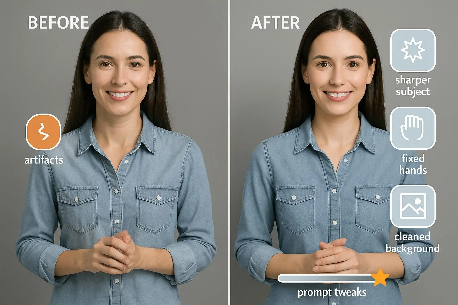
3) Artifacts and distortions: clean up the glitches
Artifacts are the AI’s weird little party tricks. Extra fingers, wonky faces, odd textures in predictable places. They’re not fatal, but they’re distracting and can derail a cover’s trustworthiness.
What I do:
- Create a robust negative prompt list. Include terms like “mutated, deformed, extra limbs, ugly, blurry, disfigured, bad anatomy, malformed, low quality, artifacts.” The more explicit, the better.
- Increase sampling steps and resolution when the tool allows. More information in the model usually means cleaner edges and fewer oddities.
- Use inpainting or outpainting for small fixes. If you notice a stray artifact in a corner, re-generate around that area or paint it out in your editor.
- Keep seeds in mind. If you land on a version with acceptable composition but some artifacts, save its seed and try small perturbations rather than a full reset.
A quick anecdote: I once attempted a fantasy character on a cover and kept getting six fingers on a hand. Incorporating “no extra limbs, correct anatomy” into the negative prompts helped, but the real fix was regenerating from a slightly different seed and tightening the pose with precise placement prompts. It’s a ritual: if artifacts appear, reset with new seed and crisp prompts.
A practical tip I use often: when you face repeating artifact patterns, suspect the foreground object and background textures. Rework the prompt to separate foreground, midground, and background with explicit descriptors. Break the scene into parts your AI can manage more reliably.
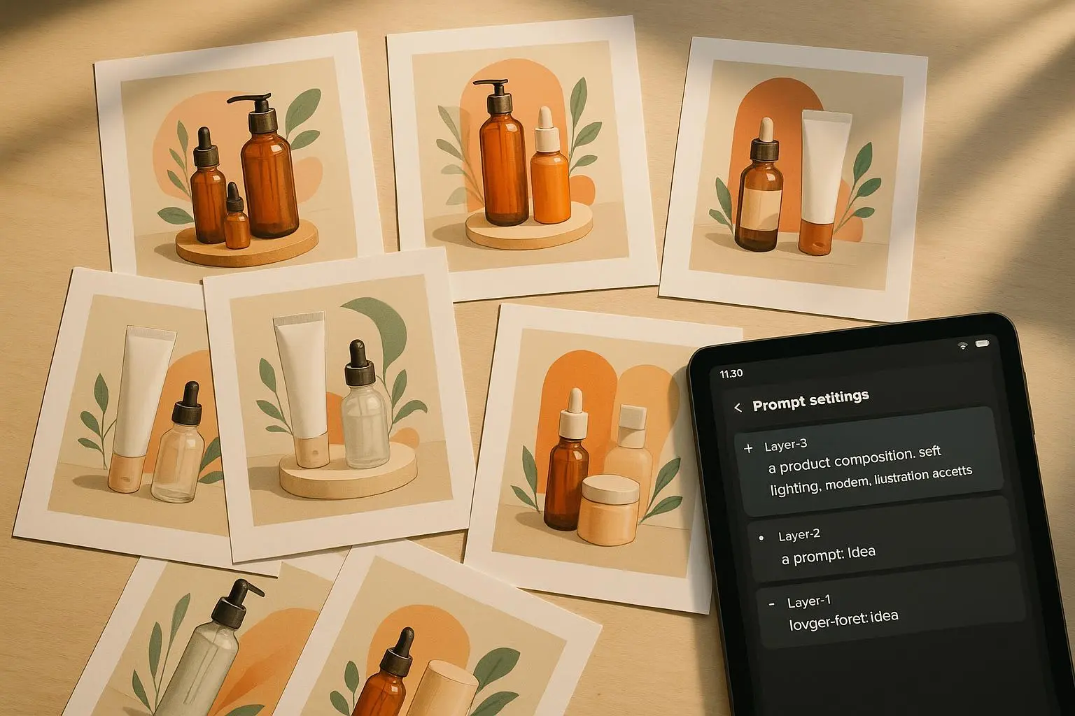
4) Style mismatches: stay true to the vibe you want
Style drift is real. You might ask for a watercolor vibe, and the AI hands you something closer to a digital oil. Or you’ll get a cohesive look in one render and a jarringly different one in the next.
What I do:
- Be hyper-specific about style descriptors. If you want a dark fantasy look, name it: “dark fantasy art, gothic architecture, highly detailed, oil painting style, dramatic lighting,” and reference artists you admire. Without precision, the model will roam.
- Use a reference image if your tool supports it. A consistent reference helps the AI lock in a vibe across generations.
- Save seeds when you land on a look you love. Reuse the seed with minor prompt tweaks to maintain consistency across multiple covers in a series.
- Start broad, then narrow. Begin with a general aesthetic, then layer in specific lighting, texture, and brushstroke details in subsequent renders.
Story time: for a mystery series, I started with “noir-inspired, high-contrast, moody lighting.” The first few versions leaned toward digital painting, which didn’t sit well with the publisher’s brief. I then added precise descriptors and aligned with two reference images—one for lighting, one for texture. The subsequent renders matched the vibe far more closely, and the publisher felt confident moving forward with a multi-cover package. The key was resisting the urge to chase a single perfect render and instead building a consistent style language you can reuse.
Tips you can drop into your workflow:
- Use a small set of weighted prompts to steer the look consistently across all variations.
- If you’re building a series, write out a one-paragraph “brand mood” for the entire set and use it as your north star for prompts.
- Consider a style pass in your editor after generation. A little color grading, texture overlay, or brush-filter can unify disparate frames.
5) Export checks and post-processing polish: from digital draft to print-ready
Even after you’re happy with a render, there’s one more step to prevent facepalm moments at print or on a glossy cover.
What I do:
- Upscale to print-ready resolution. For print, aim for at least 300 DPI. Many tools offer upscaling without losing detail, but verify the output in your editor.
- Pick the right file formats. PNG or TIFF for transparent needs and archival quality; high-quality JPEG for web variants to balance file size and quality.
- Calibrate color profiles. Most online use is sRGB; print shops usually want CMYK or a color-managed workflow. If you’re unsure, export in sRGB, then do a quick test print before finalizing.
- Tweak brightness, contrast, and sharpness. A quick pass in Photoshop or your favorite editor can salvage a muddy image or tame an oversaturated palette.
I once sent a cover to print and noticed a subtle color shift, a result of the monitor-to-printer pipeline. The fix was simple: export in CMYK-compatible workflow through Photoshop, then do a soft-proof in the printer’s settings. It saved me from a batch of reprints and kept the client confident in the process.
Another quick aside: the difference a good sharpening pass can make is real. I’ve learned to apply a light sharpening that preserves texture without turning the image gritty. That small adjustment often makes the difference between “nice” and “wow” on a cover.
A practical checklist you can reuse
Composition
- Set the aspect ratio first.
- Demand explicit placement: “centered,” “left third,” “space above.”
- Reserve space for text before you generate.
- Generate multiple frames anchored by a strong composition.
Text legibility
- Never generate text in the image.
- Create a clean space for title in the prompt.
- Add typography in a real editor after generation.
- Use robust negative prompts for text (no text, no typography).
Artifacts
- Build a strong negative prompt list.
- Increase steps/resolution when possible.
- Use inpainting/outpainting for targeted fixes.
- Change seeds if artifacts persist.
Style consistency
- Be explicit about style with references and artists.
- Use seeds to maintain look across variants.
- Layer in specifics progressively in subsequent generations.
Export and post-processing
- Upscale to print-res; check DPI.
- Choose correct file formats based on use.
- Color-calibrate for print vs. web.
- Final polish with light edits in a dedicated editor.
If you’re building a small toolkit for yourself or a team, these steps translate into a repeatable workflow you can train someone on in an hour. It’s not about chasing perfection in every render. It’s about curating a disciplined process that yields reliable, publish-ready art without turning cover design into a full-time job.
Towards a calmer, faster AI-art workflow
The beauty of this approach is in its predictability. You’re not spiraling through endless variations hoping for a miracle. You’re setting up the problem, asking the model to respect your frame, and then handing the image to a human for the finish line.
If you’re an indie author, a designer, or a musician launching a new project, you can apply this approach to almost any cover task. The core ideas—clear framing, text-free generation, artifact control, and post-processing discipline—don’t care what genre or product you’re making. They’re the guardrails that keep AI from running off with your concept.
One last thought from my own practice: the best covers I’ve produced with AI were the ones where I treated the process like a collaboration with a stubborn, incredibly fast painter. I give the painter precise instructions, I curate the results, and I step in to finish. The result is something neither of us could have exactly created alone, but together we made something both polished and personal.
If you want a quick, practical starting template, here’s a sample prompt structure I’ve used successfully on a few projects:
- Aspect ratio: 2:3
- Subject: “centered, full-body portrait, high definition, dynamic pose”
- Background: “soft gradient, minimal detail, distant skyline”
- Text space: “top area reserved for title, no text in generation”
- Negative prompts: “no clutter, no extra limbs, no text, no typography, no blur, no watermark”
- Style cues: “dark fantasy art, high detail, dramatic lighting, inspired by Frank Frazetta and H.R. Giger, reference image attached”
You’ll still need to tweak for your own taste and project. But with this scaffolding, you’ve got a sturdy base to iterate from, not a blank page that invites endless tweaks.
References
Ready to Optimize Your Dating Profile?
Get the complete step-by-step guide with proven strategies, photo selection tips, and real examples that work.