Fixing Common Text-to-Image Issues: Artifacts, Composition Errors, and Licensing Pitfalls
Feb 9, 2026 • 9 min
A lot of us jumped into text-to-image generation because it promises quick wins: a perfect illustration from a simple prompt, art on demand, a faster path from idea to asset. And sometimes it works. But more often, the result is riddled with little mistakes that kill the vibe—artifacts that look like glitches, awkward placements that break believability, or licensing gotchas that threaten the project down the line.
This is the guide I wish I had when I started practicing AI-assisted images seriously. It isn’t about chasing perfection with fancy jargon. It’s about practical fixes you can apply today, in real projects, with real results.
And yes, I’ve stood in the fire. I’ve watched a campaign image fall apart because of a misaligned product in a scene, or because the licensing terms weren’t crystal. There was a moment where we needed a twelve-image splash page in 48 hours, and the whole set looked off. I learned to slow down, test, and fix the core issues rather than mute the problem with more renders. Here’s how I deal with it now, step by step, with concrete examples and honest notes about what actually works.
Before we dive in, a quick micro-moment that stuck with me: I once spent an afternoon chasing color consistency across scenes for a product launch. The model kept swapping blues in a way that would have killed the brand. I solved it not by more prompts, but by setting a strict color palette and locking it with a seed value. That tiny discipline changed the whole project.
I’ll share a real story from my own experience to anchor this. Then I’ll walk you through artifact removal, composition and placement, licensing reality checks, and color/style control. I’ll end with a proven workflow you can reuse on your next project.
Now, let’s get practical.
How I approached a tough client brief and what I learned
Several months ago, a mid-market tech brand asked for a 6-image hero set to accompany a product launch. They wanted a clean, modern look with a hint of warmth. The kicker: the product would appear in several scenes—on a desk, in a lab, in a living room setting—and we needed a consistent color story across all images.
I started by generating rough drafts to test the tone. The first set looked fantastic in some images and odd in others. The artifacts were the worst offenders: eyes blinking strangely, hands warping into non-existent shapes, and glass surfaces turning into muddy blobs in low-light scenes. It wasn’t just a visual nuisance; it made the campaign look unpolished, which isn’t what you want for a product launch.
My first instinct was to push more prompts, more layers, more iterations. That’s when I learned the hard way that the problem wasn’t “not enough prompts.” It was “not enough control.” I pivoted to a three-part plan: artifact control, robust composition guidance, and licensing clarity. I stopped chasing one perfect render and started building a pipeline that produced consistent, releasable assets.
A micro-moment that still sticks with me: I was testing a simple product-on-desk scene and noticed the desk edge kept warping in one corner. I could tell the model wasn’t understanding the perspective. I switched to a simpler prompt, added a reference image, and used a ControlNet-like approach to pin the geometry. The table finally held its shape across multiple renders. It saved me hours and changed how I approached future scenes.
This article is basically the playbook I wish I had then. The ideas aren’t about magic prompts. They’re about building reliability.
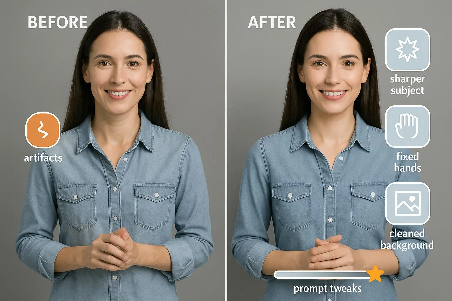
1) Taming artifacts and imperfections
Artifacts show up as fuzzy patches, odd textures, duplicated features, or strange shadows. They’re not just cosmetic; they’re a signal that something in the generation process is off. They happen for several reasons: the prompt is too complex, the training data contains conflicting features, or the model runs into its own artificial constraints trying to “fill in” gaps.
What I’ve learned works in practice:
- Refine your prompts with intention. Instead of “a portrait of a person in a studio,” write “a hyper-realistic portrait of a middle-aged man with a soft studio backdrop, 85mm lens perspective, shallow depth of field, natural skin tones.” The extra precision helps the model glean the exact features you’re aiming for.
- Use negative prompts. If the model likes to produce artifacts, explicitly tell it what you don’t want: “no artifacts, no blurring, no distortions, no duplicate features.” It sounds silly, but it helps.
- Switch models. Some prompts work brilliantly on one platform and poorly on another. If you keep seeing glitches, try a different engine (Stable Diffusion, Midjourney, DALL-E) and compare results. The differences aren’t subtle once you’ve trained your eye.
- Upscale and retouch. Tools like Topaz Gigapixel AI can sharpen details and reveal a cleaner base. A light touch in Photoshop or even a dedicated AI-based retouch tool can remove stubborn artifacts without destroying the original vibe.
- Think in passes. Generate a batch focusing on a single element (skin, fabric, glass) and fix artifacts there before reassembling the full scene.
Concrete example from my team: we needed a product shot with a glass bottle on a wooden desk. The initial render produced a nasty halo around the bottle and the wood texture looked muddy. We flipped to a simpler prompt with a clean white background for the bottle alone, then composited the bottle onto the desk in post. That “two-step” approach cut artifact cleanup time in half and kept the final look cohesive.
Real-world tip: keep a small, local color target in the frame. It helps you see color shifts and artifacts more quickly during quick review rounds.
2) Mastering composition and object placement
Composition is the art of telling a story with where things sit in the frame. AI tends to misread spatial relationships, especially with multiple subjects, reflective surfaces, or unusual angles. The result: someone looks off-center, objects float, or perspective warps.
What helps in practice:
- Be explicit about positions. Use phrases like “the product centered in the frame,” “on a clean desk, foreground, slightly to the right,” “eye-level shot,” “three-quarter view,” or “64-degree tilt.” The more precise you are, the less the model improvises.
- Use reference images or simple sketches. If you can, feed a rough sketch that dictates composition, then let the model fill in textures and color. ControlNet-like tools (or built-in equivalents) can be a game-changer here.
- Layer your prompts. First establish the composition with a rough scene. Then in a second pass, refine lighting, shadows, and object relations. Don’t try to solve everything in one go.
- Inpaint for corrections. If something looks out of place after generation, use inpainting to move an object, fix its size, or adjust its position rather than re-generating the whole scene.
- Lock perspective with a ground-truth anchor. Include a ground plane or reference grid in your prompt or reference image so the model anchors objects into a coherent space.
A quick anecdote: during a healthcare-themed set, we generated a patient portrait with a chair and a desk in a clinical room. The chair kept appearing with an odd tilt, almost like it was leaning into the camera. We switched to a controlled prompt: “chair upright, front-facing, 45-degree angle from camera, 1.2 meters away.” We used a reference image of a similar room to guide the perspective, then inpainted the chair to fix any residual tilt. The scene finally felt natural and consistent with the rest of the set.
A smaller, but telling, detail: I learned to watch for subtle perspective illusions triggered by lighting. A slightly elevated light source can make flat surfaces look sloped. If a room looks right in 2D, but one angle feels off, test a second lighting setup early in the process.
3) Navigating licensing and commercial use
This is the part where folks trip up and the project lands in a gray area. The licensing terms across AI platforms vary widely. Some allow broad commercial use, others require attribution, some license the outputs only under certain conditions, and a few have opaque terms that change over time. If you’re delivering work for a client or for public release, you owe it to yourself to be precise.
What to check and do:
- Read the platform’s terms of service with a fine-tooth comb. Look for clauses about “commercial use,” “copyright ownership,” and any restrictions (for example, restrictions on using generated faces or brand-specific content). The terms can also evolve, so a quick check before you start a new project saves headaches.
- Favor platforms that offer clear commercial licenses. If a provider explicitly states you own the rights to use the generated images commercially, that’s a big deal. It reduces risk when the asset becomes part of an ad campaign, packaging, or a marketing website.
- Consider a hybrid approach. If you’re uncertain, combine AI outputs with stock imagery or human-created assets to ensure licensing comfort. Or use royalty-free stock as a baseline and only use AI-generated variations where licensing is crystal clear.
- Document everything. Save the terms you agreed to, timestamp key decisions, and capture any specific licensing notes tied to the assets you deliver. It’s not glamorous, but it’s a shield for you and your client.
- Be mindful of identity and likeness. If your prompts generate people who look realistic, you may run into more complex licensing and model rights concerns. When in doubt, dial back to generic silhouettes or carefully crafted non-identifiable characters, and always verify the policy on face generation for your chosen model.
During a recent project, we almost ran into a licensing snag because one image’s terms were ambiguous around derivative works. We paused, contacted the platform’s support, and switched that asset to a model with a clearly permissive commercial license. It added a day to the schedule, but it saved us from a potential legal rabbit hole and a messy client call.
One practice I’ve found helpful: keep a one-page licensing cheat sheet for each project. It lists the tools you used, the exact terms you relied on for that set, and the permission status for the final outputs. If a client asks questions later, you can point to the sheet, not a stack of terms you skimmed once in a fevered moment.
4) Controlling color consistency and style across assets
Color drift is the silent killer of multi-image campaigns. Even when each image looks great on its own, slight shifts in hue, saturation, or warmth can break the whole sequence. The same goes for style—one image veers toward watercolor while the next leans photorealistic, and your brand feels inconsistent, not intentional.
Strategies that actually move the needle:
- Provide stable style anchors. Give the AI a color palette and a style reference (an artist's name, a mood board, or example images). If you can, upload a consistent reference frame so the model has a baseline to follow.
- Use explicit color prompts. Instead of “blue and green tones,” say “cool blues with muted emerald accents, high-contrast shadows, and soft, natural skin tones.” The more concrete you are, the less the model improvises.
- Lock seeds across generations. If you’re making a set of images, fix the seed values. This ensures that similar prompts start from the same random baseline, improving consistency across outputs.
- Control lighting, not just color. The lighting setup strongly affects color perception. If you standardize lighting (soft key light, neutral fill, subtle rim light), the color outcomes stay closer as you generate variations.
- Audit and correct in batches. Generate several variants, then pick a preferred palette to apply to all, rather than re-running every asset from scratch with minor tweaks.
I learned this the hard way on a fitness-brand launch. We had six product shots and two lifestyle scenes. Each image looked good in isolation, but the greens and teals in the brand palette drifted by 5–8% between frames. We tackled it by choosing a tight color range, applying the same palette to all prompts, and locking seeds for every render in the set. The final hero set felt cohesive, and the client didn’t have to squint to compare assets side-by-side.
Real-life detail: not all color drift is visible on a single screen. If you’re reviewing assets in isolation, you might miss how they read next to each other on a landing page. Build a quick “page mock” with all six images together to spot any drift before you finalize.
5) A practical workflow you can steal
Here’s the workflow I use now for mid-sized projects. It’s simple, repeatable, and doesn’t demand heroic prompt engineering every time.
- Define the brief in plain language. What mood, audience, and use case? Which scenes are required? What’s the must-have moment in each image?
- Set the baseline. Pick a primary model and gather 2–3 reference images for style, lighting, and composition. Create a color palette and a few ground rules (e.g., “no faces, unless necessary,” “portrait shots only with front-facing angles”).
- Generate in passes. First pass: composition and layout. Second pass: color and lighting. Third pass: detail passes for artifacts and texture.
- Use negative prompts. Pair every prompt with explicit exclusions to steer the model away from unwanted artifacts, distortions, or awkward placements.
- Inpaint and adjust. Don’t force a single render to be perfect. If something’s off, fix it in a targeted way with inpainting or targeted edits.
- Lock seeds for consistency. If you’re doing a suite, keep seeds consistent across assets that should feel related.
- Validate licensing. Confirm you have a clear commercial-use license for every image. Save the terms and a quick note on how you intend to use the asset.
- Review in a live mockup. Put all assets on a real page or slide deck to check color, scale, and composition in context.
- Iterate only where necessary. Don’t chase perfection in every asset. If it meets the brief and licensing, ship it.
- Document everything. A one-page project brief with prompts, seeds, licenses, and caveats saves you in reviews and future work.
If you want to speed up, pair this with a small toolbox: a reliable upscaler, a few paint-overs in a photo editor, and a straightforward licensing checklist. The goal isn’t to become a prompt wizard; it’s to deliver assets that your team can trust, on time, with a clear licensing path.
Final thoughts: when to push and when to pause
Text-to-image generation is a powerful tool, but it’s not a magic wand. You’ll still need human judgment—especially for brand alignment, legal safety, and storytelling. The most reliable projects I’ve worked on were those where we treated AI-generated assets as a portion of the final composition, not the entire piece.
If you’re new to this, start with a narrow scope: a single hero image, a single product, a single color story. Build confidence with a small win before expanding. That’s how you avoid the anxiety of chasing the perfect render across a dozen images and a tight deadline.
Remember this: artifacts are symptoms, not the disease. Bad composition is a signal you didn’t lock your constraints. Licensing confusion is a risk you can remove with clear terms and documentation. Color drift is a failure of consistency, not a creative limit. When you tackle these three pillars, your AI-assisted visuals will feel earned, not improvised.
References
Ready to Optimize Your Dating Profile?
Get the complete step-by-step guide with proven strategies, photo selection tips, and real examples that work.