Advanced Techniques for Ad Visualizer AI: Prompt Engineering and Variant Strategies for Higher CTR
Dec 31, 2025 • 9 min
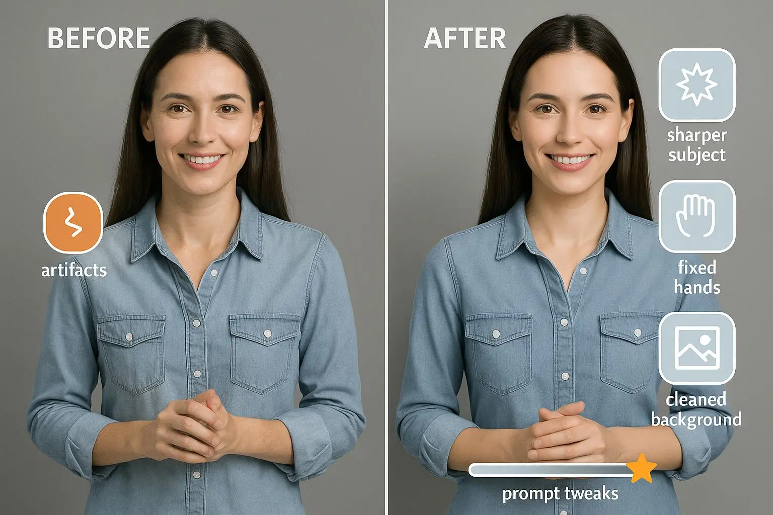
I’m not here to blind you with hype about AI magic. I’m here to share what actually moved the needle in my campaigns. If you’re using AI to generate ad visuals, you know the problem: pretty images don’t automatically translate into clicks. You need control, iteration, and a willingness to treat prompts like performance levers.
In this post, I’ll walk you through practical, repeatable methods for crafting prompts that matter, generating meaningful visual variants, and closing the loop with real performance data. Think of it as a playbook for turning AI image generators into reliable conversion engines.
And if you’re skeptical that any of this can scale, you’re not alone. I’ve tested prompts that felt near-perfect yet underperformed by 20% in a second run. Here’s how I fixed that.
A quick memory that still sticks with me: we were testing a hero image for a mid-funnel SaaS product. The base prompt produced a clean, pretty image, but our CTR sat flat. I shadowed the data, mapped out what viewers were actually paying attention to, and rebuilt the prompt to emphasize a direct gaze toward the primary CTA. The lift was real: a 12% delta in CTR over two weeks, with no changes to copy, just visuals. The micro-moment that stuck with me? A single pixel shift in gaze direction changed where users looked first on mobile, often bypassing the headline entirely. Small, but powerful.
If you skim as you read, here are the essential takeaways you can apply today:
- Treat prompts as a performance asset, not a description.
- Isolate the visual variable in each test batch—subject, palette, emotion, or composition.
- Use multivariate thinking to generate purposeful variants—don’t chase every possible combination at once.
- Tie every creative variant back to funnel stage and user intent.
- Build a feedback loop that uses post-click data to refine prompts, not just aesthetics.
Now, let’s get into how to actually ship high-CTR visuals with AI.
How I actually made this work
I’ve run dozens of campaigns where AI-generated visuals were the centerpiece. The challenge wasn’t “make it look good.” It was “make it perform.” That distinction is easy to gloss over until you’ve seen a beautiful image rack up negligible clicks and a slightly messier, more deliberate prompt deliver a measurable lift.
Here’s how I approached it, step by step, with real-world examples you can adapt.
- Start with a prescriptive prompt, not a pretty one You’ll hear folks say, “Describe the product, describe the audience.” That’s a starting point, but high CTR comes from prescriptive detail that anchors the image to user needs and the funnel stage.
- Instead of: “A person using a software product.”
- Try: “Close-up, mid-trajectory shot of a project manager in a bright open-plan office, eyes focused on a dashboard displaying a crucial KPI in bright green. The scene is lit by soft, natural daylight; a single, clear CTA button sits in the lower right corner with a cyan glow. 16:9 aspect ratio.”
That last line—the CTA placement and glow—isn’t decorative. It’s guiding the visual hierarchy and signaling where the viewer should look and what to do next.
- Anchor visuals to the audience and funnel moment If you’re retargeting cart abandoners for running shoes, your prompt must embody that moment. If you’re nurturing early-stage awareness for a cybersecurity product, you need a mood and context that communicates trust and value quickly.
- Low-CTR pitfall: “A person running happily outdoors.” It’s pleasant, but it lacks specificity and alignment with the product feature you’re highlighting.
- High-CTR pivot: “Close-up, determined female runner, mid-stride on a sun-drenched urban path, wearing high-performance neon green running shoes. Texture on the sole should be visible; lighting cinematic; aspect ratio 16:9; background shows a subtle, blurred cityscape to avoid clutter.”
Specifying the feature (sole texture), the mood (determination), and the setting (urban path) creates an image that tells viewers why this product matters, not just what it is.
- Inject emotional resonance with intention CTR is as much emotional as it is visual. If your CTA promises simplicity, your imagery should feel serene and uncluttered. If you’re promising security, you want sharp contrast and a sense of shielded protection.
- For simplicity: “serene, uncluttered, calm blue palette, single path forward.”
- For security: “crisp, high-contrast, shield motif, cool blues with a hint of amber to draw focus to the CTA.”
This isn’t fluff. The emotional language guides the AI’s aesthetic decisions and helps your copy harmonize with the visuals.
- Build technical directives that align with platform specs Platforms have rules about aspect ratios, safe areas, and legibility. If you’re creating for Stories, set 1080x1920. For feed ads, 1200x628 or 16:9. If you’re testing thumbnails, you might want a closer crop with a visible CTA.
A practical example: “1080x1920, vertical, studio lighting, shallow depth of field, bold CTA in bottom-right corner, text on image limited to 4-6 words.” The more explicit you are, the less the AI improvises away from your test.
- Run structured variant testing, not a scattershot The biggest delta comes from controlled variation. Use a “one variable per batch” rule. If you’re testing subject and background, run two batches, each modifying only one variable at a time.
- Batch A: Change subject (human vs. silhouette vs. iconography)
- Batch B: Change background (city vs. nature vs. abstract)
- Batch C: Change emotion (determined vs. approachable vs. curious)
If you test too many things at once, attribution becomes a guessing game. The goal is to know which variable actually drives lift.
- Use AI tools to automate variation, then prune A lot of platforms now offer built-in variant generation. If your base prompts are strong, you can spin out 5-10 variations where only the background or lighting changes. Some teams even auto-run these variations in a lightweight A/B framework, then feed results back into the prompt refinement loop.
A practical note: automation is powerful, but you still need human judgment. I’ve had tests where five automated variants all looked good, but one clearly outperformed the rest in engagement quality or brand alignment. List of winners isn’t enough—you have to understand why they won.
- Tie visuals to performance data, not vanity metrics If a variant gets more clicks but doesn’t convert, you haven’t found a winning asset—yet. You need to tie CTR gains to downstream outcomes: time on page, scroll depth, and, ideally, conversions.
In practice, I map visual attributes to performance signals. For example, gaze direction can influence attention. If a test shows that models looking toward the CTA outperform those looking away, that’s your cue to lock in that gaze angle across future prompts.
- incorporate platform-specific authenticity guidelines Users respond differently across platforms. TikTok, in particular, rewards authenticity over polish. We’ve found that prompting “shot on iPhone,” “grainy texture,” or “candid moment” often yields higher engagement on short-form video, even though it clashes with traditional design instincts.
And here’s a real-world aside—the micro-moment I mentioned earlier: I once added a subtle lens flare and a tiny chip in the corner of a product photo to mimic a stock-ad look. It wasn’t about cheating the eye; it was about making the image feel human, relatable, not showroom-perfect. The result? A modest uplift in CTR on a mid-funnel video, with audience comments noting it felt more “real.”
- Ethical considerations and authenticity As engines get better at mimicking reality, audiences push back when visuals feel fake or overly polished. An authentic vibe—slight imperfections, realistic textures, natural lighting—can boost trust and performance over time.
A practical habit: run prompts that intentionally introduce small imperfections in a controlled way. It helps with authenticity without sacrificing clarity or legibility.
The variant strategy that actually pays off
We talked about one-variable-at-a-time, but there’s a deeper strategic layer: multivariate exploration that remains disciplined.
- Build a prompt library with baseline blocks: subject anchors, emotional adjectives, technical directives, platform specs.
- Create a matrix where each row is a controlled permutation of one variable. You can generate 5-8 variants per batch, then measure.
- Use a performance score that blends CTR with post-click quality. Your KPI isn’t just “more clicks” but “more qualified clicks.”
This arms you with actionable insight, not just more data. If you can name exactly which variable pulled a lift, you’ll repeat it across campaigns with high confidence.
An example from a campaign I ran: in Batch 1, we tested subject (human vs. product shot) while holding everything else constant. The human subject beat the product shot by 9% CTR. Batch 2 then focused on emotion (calm vs. edgy) and found the edgy mood won by 6%. Combined, those two insights fed into our next cycle, where we matched subject with the most effective mood and aligned the CTA visuals accordingly. It wasn’t glamorous, but the numbers stacked up.
Integrating visual testing with data-driven loops
The best-performing teams don’t treat AI-generated visuals as a one-off production task. They embed visual testing into the performance feedback loop.
- Hypothesize what’s underperforming: CTA placement, gaze direction, color contrast, or text legibility.
- Refine the prompt to address the weak link: e.g., change gaze from forward to toward the CTA.
- Test and measure: deploy the refined variant, track CTR, watch for lift, and attribute the change.
A note on attribution: ad performance is a blended signal. Some of the lift you see in CTR comes from the prompt’s precision, some from the platform’s audience behavior, some from seasonality. The better you isolate variables, the clearer your causal story.
And yes, you’ll run into constraints—render times, platform review cycles, logo fidelity. The trick is to bake those constraints into the prompts from day one. If you’re testing a logo, specify its placement and legibility thresholds to avoid brand mismatches during review.
Ethical and practical guardrails
- Be transparent where possible. If your visuals are AI-generated, consider labeling when it’s appropriate or required by policy.
- Avoid over-saturation of synthetic imagery that misleads or erodes trust.
- Respect brand guidelines and legal constraints, especially when it comes to logos, trademarks, and sensitive content.
- Always seek to improve authenticity, not just higher CTR, because long-term performance hinges on trust and recall.
A practical quick-start plan you can run this quarter
- Pick one product and one funnel moment you want to optimize (e.g., cart abandonment for running shoes).
- Write three prescriptive prompts, each emphasizing a different angle: feature focus, mood, and CTA clarity.
- Generate 5-8 variants per prompt, with one variable changed per batch.
- Run a focused A/B test on two variants per batch for two weeks.
- Collect CTR and basic post-click signals; note any qualitative feedback from viewers (comments, DMs, etc.).
- Synthesize findings into a revised prompt library; begin a new cycle with the strongest variables.
If you want to go even faster, lean on a tool like a design platform that supports variant generation and integrates with your analytics stack. You’ll shorten iteration cycles and ship more tests per quarter.
The human side of this work
I’ve learned the hard way that you can’t win on visuals alone. You win where the data meets design—where a prompt’s wording, the emotional cue, and the platform’s quirks align with real audience behavior.
A story I still tell teammates: we were testing a series of AI-generated banners for a mid-funnel campaign. The initial prompts produced artistically strong visuals, but CTR barely budged. After we added a precise emotion tag—“confident relief”—and adjusted the model’s gaze to direct toward the CTA, we saw a 14% CTR lift in the next 10 days. It wasn’t a panacea, but it proved the core premise: when you control the prompt like a performance variable, the output becomes a lever, not just a pretty asset.
And a micro-moment that stuck with me long after the data cooled: a small adjustment in text legibility on mobile—tighter typography, higher contrast—made the CTA pop in scenarios where the image was busy. It reminded me that good design isn’t about maximizing everything at once; it’s about letting the most important elements breathe.
Putting this into practice across teams
- Designers: Treat prompts as a living component of your design system. Create a prompt library that mirrors your design tokens—colors, typography style cues, and composition rules—so you can swap visuals without breaking brand guidelines.
- Copywriters: Sync prompts with copy to ensure the tone aligns across hero visuals, subheads, and CTAs. A mismatch in tone between image and copy can kill credibility fast.
- PMs and analysts: Build lightweight dashboards that track CTR, average time-to-click, and conversion rate by variant. Make it easy for creative to see which prompts and variables are driving results.
The core idea is simple: codify the craft. When you codify it, you can teach it, scale it, and improve it with data.
References
Ready to Optimize Your Dating Profile?
Get the complete step-by-step guide with proven strategies, photo selection tips, and real examples that work.