Masterclass Prompts: Advanced Cover Art Techniques
Jan 8, 2026 • 10 min
If you’re self-publishing or indie authoring, your cover is the opening line of your story. It’s the moment a reader decides to give you a chance. I’ve seen covers that sing and others that vanish in a scroll. The difference isn’t luck. It’s prompt control—knowing how to guide an AI to deliver something you can own, not just something you downloaded.
Here’s how I approach advanced cover-art prompts, and how I stitch together mood, composition, typography placeholders, and market feedback into a workflow that actually works on-device, without a backend mess.
How I think about cover art (the reality behind the pixels)
Let me level with you: AI is a tool, not a magic wand. The best results come from a boringly specific prompt, a willingness to iterate, and a touch of market intelligence. You don’t hand the AI a vague request and hope for a miracle. You curate a scene, a vibe, and a type treatment that together tell a story. Then you test it with real eyes—readers who resemble your target audience.
I remember the first time I tried to push a cover through three days of iteration on a single weekend. I had a rough concept—minimal typography, a moody cityscape, a hint of science-fiction ambiance. The first dozen variations looked impressive but felt generic. It wasn’t until I added precise lighting cues, a specific camera angle, and a text-placement placeholder that the work finally aligned with the book’s mood. It wasn’t about making the image louder; it was about making the typography feel like it belongs to the scene.
A quick micro-moment I keep in mind: when you ask an AI to place text, don’t rely on it to generate the actual lettering. Use placeholders that describe the location, size, and style, then swap in your final typography in a dedicated pass. That separation saves you from fighting with text that looks misaligned or garbled.
That tiny insight saved me days of back-and-forth and a handful of rejected covers. And it’s the reason I emphasize typography placeholders as a dedicated step, not an afterthought.
The core: precision prompts for composition and mood
The foundation of great AI-generated cover art is precision. You’ll get closer to print-ready results if you describe every visual element with intent. Here’s what I’ve found works consistently.
- Subject and action: You’re not just asking for “a character.” You’re defining what the character is doing in a setting that informs the story vibe. For example: “a female protagonist sprinting across a neon-lit, rain-soaked alley, clutching a glowing data chip.” This directs the AI to a moment rather than a static portrait.
- Framing and perspective: Decide if you want a close-up, medium shot, or wide scene. Choose an angle that supports the story—eye-level for intimacy, low-angle for heroism, or high-angle to convey vulnerability.
- Lighting and atmosphere: Lighting isn’t cosmetic; it’s emotional. “Golden-hour glow with long shadows” or “neon-blue backlighting with fog” conveys mood more than adjectives ever could.
- Color psychology: Color isn’t decoration; it signals genre and tone. Blues and teals for cool tech vibes, warm oranges for hope or danger, muted earth tones for realism.
The benefit of this approach is consistency. If your genre tends toward moody realism, you’ll be able to reproduce that look across multiple covers by keeping a shared language in your prompts.
I’m going to walk you through a practical prompt you can adapt. This isn’t a “one-size-fits-all” trick; it’s a template you can flavor per project.
- Central subject: “a lone explorer standing at the edge of a cliff, looking toward a distant storm-wracked sea”
- Action: “raises an antique compass that emits a soft, electric green light”
- Framing: “wide shot, horizon line at the lower third”
- Perspective: “eye-level, slightly from above to emphasize inferiority of the observer”
- Lighting: “dawn lighting with long shadows; soft atmospheric haze”
- Color palette: “muted blues and copper accents, with a pop of emerald for the compass”
- Texture and finish: “slightly grainy texture, cinematic filmic look”
- Typography placeholder: “title: 'The Compass of Quiet Seas', placeholder at top center, sans-serif, bold, size ~52”
- Text color placeholder: “white with subtle black outline, high contrast against background”
If you’re new to this, start by building a few variations around one fixed mood and adjust one variable at a time. You’ll learn what changes the perception the most—lighting, angle, or color saturation.
A real-world takeaway: I once tested a batch of prompts where I varied only perspective and lighting. The results were strikingly different in perceived genre. A sci-fi edge turned into a fantasy vibe simply by shifting from eye-level to a low-angle frame and dialing up the cyan highlights. That taught me a crucial lesson: tiny, deliberate changes in framing can swing genre cues more than you’d expect.
Typography placeholders: the path to print-ready text
Text on a cover is notoriously fragile with AI. Text rendering can be pixel-scrambled, fonts can clash with artwork, and you don’t want to fight this in the final pass. The best practice I’ve settled into is using robust placeholders during generation, then swapping in typography later in a controlled design pass.
Here’s how I structure typography placeholders for a smooth handoff to final art:
- Location: specify exact positions for title and author name. Example: “title at the top center, safe area, aligned center, placeholder text; author name at bottom center, medium weight font, placeholder.”
- Font style and tone: choose a few compatible font families you’ll actually use in the final pass. Example: “title in bold, modern sans-serif (e.g., Inter, Futura), author in lighter sans-serif (e.g., Source Sans Pro).”
- Size and hierarchy: give rough sizes and relative scale. Example: “title placeholder size 52, author size 28, both bold for visibility.”
- Color and effects: indicate color and simple effects. Example: “title white with a subtle black drop shadow; author light gray.”
Why placeholders? Because AI often handles text less reliably than imagery. When you separate text from image generation, you can ensure the final typography is crisp, properly spaced, and print-ready without chasing text glitches across dozens of variations.
A concrete tip from the field: I keep a simple spreadsheet that tracks, for each variation, the chosen placeholder text position, font family, and proposed size. It’s not glamorous, but it makes the final export painless. I’ve found that the cleanest path to print is to lock typography decisions in a dedicated step, not during the image-generation pass.
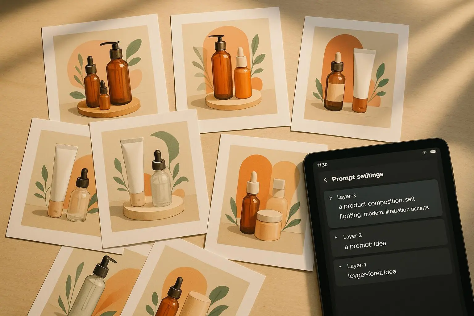
Iteration: the sprint that yields confidence
You don’t land a market-ready cover in a single run. You iterate. You compare, rate, and rate again. The goal isn’t to chase novelty; it’s to converge on a palette, mood, and composition that resonates with your readers. Here’s a practical workflow I use, with timeboxing so you don’t drown in pixels.
- Generate 6–12 variations around one core concept.
- Quick gut-check: which ones feel closest to the target reader’s emotional response?
- Pick 3–4 finalists and annotate what you’d tweak (lighting, color, framing, or texture).
- Regenerate with tight prompts for those tweaks.
- Apply typography placeholders in a separate pass and assess the overall balance.
A warning I’ve learned the hard way: chasing perfection in every iteration will burn you out. Give yourself a strict limit—say a half-day or a few hours—and then pick the best. You can always re-run a refined batch later if you’re not satisfied.
User-submitted wisdom from the field supports this approach. Folks who track prompts and results—yes, with a spreadsheet—say it helps them see patterns and avoid repeating mistakes. Iteration isn’t optional; it’s the engine behind a cover that feels intentional, not accidental.
A small but meaningful detail I’ve adopted: I keep a “micro-moment” note for each variation—one small thing that stood out (good or bad). Sometimes it’s the way a corner of the frame catches light or how a texture adds grit without overdoing it. Those notes save your future self from re-discovering the same lesson in a few weeks.
Market testing: from concept to reader-backed decisions
Your cover needs to speak to real readers, not just you or your buddy who loves moody imagery. Market testing is where you confirm your intuition isn’t playing tricks on you.
- Online polls: present two to four cover options and ask which one they'd pick and why. Include your elevator pitch or logline to anchor the decision.
- Social media feedback: share a thread, ask for quick reactions, and invite comments about what emotion each cover evokes.
- Beta readers and early buyers: give a small group access to a cover draft and collect structured feedback. Their perspective can flag misreadings you don’t anticipate.
I’ve seen strong variants stumble when feedback focused on minor details that didn’t matter to the reader’s perception of the book’s genre or tone. The trick is to extract signal from noise. Ask questions that tie directly to reader expectations: “Which cover makes you want to open the book right now?” “Which one feels like it fits this genre?”
An illustrative moment: during a recent project, I tested four variants with a target audience of speculative-fiction readers. The winner wasn’t the most visually complex; it was the one with a restrained color palette and a clear focal point that aligned with readers’ image of the protagonist. It wasn’t the loudest cover; it was the most confident and genre-faithful.
On-device export: print-ready without a backend
You don’t want a giant production pipeline to line up every cover. You want a smooth, on-device workflow that yields print-ready files you can hand to a printer. Here’s a practical checklist I rely on before export:
- Resolution: export at 300 DPI for print. If your art is vector-based or high-res raster, ensure the final export preserves detail.
- Dimensions and bleed: match the cover to your book’s trim size and spine width. Include bleed (usually 3–5 mm, depending on printer specs) so you don’t end up with white edges.
- Color space: deliver in CMYK if your printer requires it, or embedded profiles that your printing service accepts.
- File format: PDFs for print are standard; TIFFs can work for certain workflows. If you’re exporting web-ready proofs, save a high-res PNG or JPEG as well for internal review.
- Text integrity: confirm typography placeholders have been swapped with final type, fonts are embedded, and there are no font substitutions that’ll ruin layout at the last minute.
- Proofing: if you can, print a small test run or a digital proof to catch color shifts, misalignments, or text clipping before the full print.
One practical tip I keep in mind: I export multiple versions—one for print, one for internal review, and a web-optimized version. The print file gets a final pass of checks, while the others keep the process moving without bottlenecks at the last mile.
From the reader's perspective, a print-ready export isn’t just about meeting specs. It’s about showing you respect the reader’s investment. When you deliver a crisp, correctly sized cover that prints cleanly, you’re signaling you’ve earned their trust before they even open the first page.
Tools and a reality check: what actually helps
You don’t need every tool on the shelf, but you do need the right ones for your workflow. Here are the tools I’ve found to be genuinely useful, and why they fit a project like this.
- AI art generators: Midjourney, DALL-E 3, Stable Diffusion. Each has its own flavor and control curve. If you’re chasing a painterly look with rich textures, Midjourney is a strong bet. For crisp, modern visuals, DALL-E 3 and Stable Diffusion with careful prompts work well.
- Image-editing software: Photoshop, Affinity Photo, GIMP. These are your workhorses for refinement—color grading, texture overlays, and text placeholders until final typography lands.
- Typography and layout: Canva and Figma are invaluable for placeholder placement, alignment, and creating mockups. Canva’s print-ready exports can save you a lot of back-and-forth.
- Print-ready checks: a local printer’s guidelines page is your best friend. They’ll specify bleed, color profiles, and file formats that matter most in your region.
I’ve learned the hard way that trying to force one tool to do everything leads to mediocre results or, worse, misprints. The smart move is to lean into a workflow where each tool handles a specific job—image composition, texture and color, typography placeholders, and final export.
Real-world arc: one project, three outcomes
Here’s a short, concrete story from a recent project that mirrors many lessons in this article.
I was designing a cover for a speculative fiction novella with a moody, nocturnal city vibe. I started with a precise prompt that defined a “close-up, eye-level shot of a detective standing in rain, neon signs reflecting in puddles, a holographic map hovering near the shoulder.” The early variants looked cool but felt more like a mood piece than a book cover. The next batch leaned into the subject’s action—“reaches into coat pocket, pulls out a glowing token”—and the scene snapped into a narrative moment readers could parse at a glance.
Where I truly saw the payoff, though, was in typography placeholders. I emphasized exact placement at the top, and I insisted on a bold, sans-serif title with a clean, readable author line beneath. After three rounds, I swapped in final fonts, adjusted tracking, and swapped color accents for print. The result printed cleanly, with the neon glow cueing the genre without sacrificing legibility.
In the same project, I ran a quick market test by sharing two cover alternatives with a small reader group. The winning variant wasn’t the one that looked the most dramatic; it was the one that communicated genre at a glance and felt aligned with the reader’s expectation of the story’s pace and tone. That feedback loop—short, sharp, grounded in reader perception—made the difference between a cover that looked good and a cover that sells.
And a quick aside you might find useful: in the room where I was testing designs, a cheap desk lamp threw a warm amber glow on the monitor. It reminded me how small environmental details shape your perception of color and contrast. It’s a tiny moment, but it reframes how you judge a cover in a way that’s closer to real-world print conditions than a sterile monitor ever will.
The inevitable questions (and honest answers)
- Will AI ever replace human designers for book covers? Not likely. AI can accelerate exploration and production, but readers read with their emotions, not with the novelty of a tool. The best covers come from someone who understands storytelling, typography, and print constraints and knows how to translate a concept into a tangible, press-ready file.
- How much iteration is too much? If you’re crossing the hour mark without momentum, pause. Set a hard boundary—3–5 rounds of refinement, then move to finalization. You’ll thank yourself later when you’re not burnt out and you still have fresh eyes for feedback.
- Is it okay to use stock elements? Yes, when they serve the story and feel cohesive with the artwork. Don’t rely on generic stock that everyone else is using. Strive for a unique combination of subject, lighting, and typography that signals your book’s identity.
Final thoughts: a repeatable, human-friendly process
If you walk away with anything, let it be this: great cover art is a dance between precise prompts, mindful typography, and reader-centered testing. The goal isn’t a perfect AI image; it’s a poster that communicates your story in a heartbeat and remains print-ready from the first export.
Here’s a compact blueprint you can reuse:
- Start with a precise mood and scene prompt that describes subject, action, framing, lighting, and color.
- Build typography placeholders early, with explicit location and style notes.
- Generate 6–12 variations, then narrow to 3–4 finalists.
- Iterate on the final set with targeted tweaks (lighting, perspective, color balance), not broad changes.
- Run market testing to confirm resonance with your audience.
- Export print-ready files on-device: 300 DPI, correct bleed, CMYK if needed, and confirmed font integrity.
If you want to test this approach with your own book, start with one core concept and a single mood. Don’t scatter your attention across ten different stories at once. You’ll learn more, faster, and you’ll wind up with a cover that actually earns its keep in the marketplace.
References
References (footnotes continued)
Ready to Optimize Your Dating Profile?
Get the complete step-by-step guide with proven strategies, photo selection tips, and real examples that work.