Beginner Tutorial: Create Beautiful Botanical Posters from Plant Descriptions
Jan 5, 2026 • 10 min
You don’t need a studio full of brushes to make gallery-worthy botanical posters. You need a few good prompts, a sense for print-ready detail, and a workflow that keeps you from chasing dead ends. I’ve tried all the wrong turns so you don’t have to.
This is a practical guide for makers, Etsy shop owners, and gift creators who want to turn simple plant descriptions into high-resolution, saleable art fast. I’ll walk you through three core steps—prompting, print-ready output, and a tight post-generation workflow—with real-world notes, numbers, and a story from my own experiments.
How I got here: a quick, imperfect start that still helps
A year ago I started playing with AI-assisted botanical posters as a side project. My intent was simple: turn plain descriptions into something printable that people would actually want to buy. I spent weeks tinkering, testing prompts, chasing perfect color, and fighting with aspect ratios that wouldn’t fit standard frames.
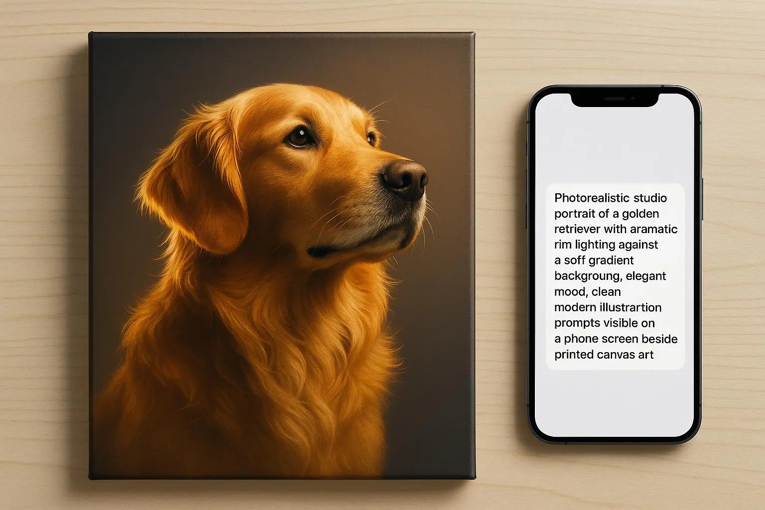
One afternoon I remembered a stubborn fern I’d described as “a delicate, lacy green frond with bright mid-green pinnae.” The first few outputs were pretty, but they looked more like stylized wallpaper than a botanical plate. Then I nudged the prompt toward anatomy—“fern frond, pinnules with serrated margins, sori visible on the underside, precise venation”—and I wrote down the exact DPI and size I’d use for printing: 300 DPI at 18x24 inches. The result? Clean lines, true-to-life venation, and a poster that framed well in a coffee shop display.
A quick aside that stuck with me: in print, the difference between “soft enough” and “print-ready” is often a single setting. If you don’t push for 300 DPI and the correct aspect ratio, you’ll be disappointed when your image goes to the printer.
Now I design with a simple rhythm in mind: describe precisely, specify the print target, and validate the output at the final step. You’ll see why this matters in a minute.
And yes, I have a real, human moment to share. I was demoing a new prompt to a friend who runs a tiny Art-to-Order shop. We were comparing a Calathea leaf study—one with bold, high-contrast veins and another with a softer watercolor wash. The first was too clinical; the second looked nice on a screen but vanished when printed on matte paper. We finally found the sweet spot by combining a crisp line-art baseline with a gentle watercolor glaze. The tiny detail that mattered? We saved a separate PNG for a transparent background and kept a layered PSD file for post-processing. It’s the little things—the small format choices and the export settings—that make the difference between “nice” and “print-ready.”
If you’re skimming, here’s the micro-moment distilled: get your target print size first, then tailor prompts and exports to that size. It sounds obvious, but it’s where a lot of drift happens early on.
What you’ll build here: a clean, repeatable workflow
This isn’t a one-off experiment. It’s a repeatable workflow you can lean on for dozens of plant descriptions without reinventing the wheel each time.
- Start with a precise Subject prompt: the plant’s scientific name, a view, and a couple of anatomical cues.
- Add a Style cue that fits your brand: vintage lithograph, modern minimal line art, or a watercolor wash.
- Lock in Specification: 300 DPI, print-ready output, and a target aspect ratio (common ones: 2:3 for 18x27, 3:4 for 12x16, 1:1 for square frames).
This structure is the backbone of scalable art. It lets you generate variations quickly while keeping a consistent aesthetic across a whole collection.
Here’s how I’d walk you through it, step by step.
Step 1: Master the prompt—the DNA of your poster
Think like a curator, not just a searcher. A strong botanical prompt has three parts: Subject, Style, and Specification.
- Subject: Be precise. Instead of “flower,” use “Papaver somniferum (Opium Poppy), frontal view of the seed pod with fine seed surface.”
- Why this matters: AI references visible anatomy. You want the seed surface texture, not a generic bloom shape.
- Style: Decide the look you want for your shop. Do you want a 19th-century scientific plate feel, a crisp modern line art, or a watercolor bloom?
- Examples: “hand-colored lithograph,” “minimalist line art with soft gray shading,” or “vintage Ernst Haeckel-inspired style.”
- Specification: Print quality matters. Always note DPI and dimensions: “Ultra-detailed, 300 DPI, 18x24 inches, CMYK-ready, transparent background optional.”
- Pro-tip: If you plan to print on colored paper, consider embedding a subtle paper texture in the background to reduce the risk of banding.
A quick example prompt shaping:
- “Papaver somniferum, frontal view of the seed pod with intricately textured surface, line-art base with subtle watercolor wash, 300 DPI, 18x24 inches, CMYK-ready.”
If you’re curious about consistency across a batch, you’ll want to seed your prompts with a controlled variable: a seed value or a very similar descriptive backbone for every plant. It helps the AI produce visually cohesive results across an entire collection.
A tiny aside that stuck with me: the color story you choose will drive a lot of downstream decisions. If you go saturated and bold for one plant, you should balance that with a restrained color approach for others in the same set. Consistency buys trust with buyers.
Step 2: Choosing the right platform for print quality
You’ll hear a lot about “the tool” that makes it easy to generate art. In practice, the best results come from matching the tool to your needs, not chasing the flashiest feature.
- Resolution matters more than novelty. For posters, you want outputs that can scale to at least 18x24 inches at 300 DPI. If your generator tops out at 1024x1024, you’ll need upscaling. If you can generate at 4096x4096 directly, you’ll save yourself a ton of post-processing work.
- Aspect ratio control is a must. A lot of early outputs look great but don’t fit standard frame sizes. You’ll thank yourself for forcing aspect ratio locks (2:3, 3:4, 1:1) early.
- Export quality matters. A clean PNG with transparent background and a TIFF or high-quality JPEG for print is ideal. In practice, you’ll often need both a print-ready file and a layered file for color tweaks.
In our space, there are a few players you’ll hear about most for print-quality outputs. Midjourney is a favorite for high-fidelity images with a lot of texture, while dedicated upscaling tools like Topaz Gigapixel AI help push older renders to 300 DPI after the fact. You’ll also see Adobe Express or Canva Pro used for final layout and typography. Use the right tool for the right job, not a single one-for-all mentality.
One practical note I learned the hard way: a few users chase a perfect early render, then spend hours trying to nudge it into a print-ready state. It’s better to design for print from the start and treat the first pass as concept art rather than the final product.
A micro-moment about workflow speed: having a saved “print-ready spec” template in your editor (two versions: one for 18x24, one for 24x36) is a small investment that pays off over dozens of posters. It reduces dithering and keeps your collection cohesive.
Step 3: Post-generation refinement and preparation
Even the best AI output benefits from a human touch before printing. Here’s a lean, practical checklist you can actually use.
- Color management: Colors can drift. Check your monitor’s calibration, then do a quick proof in your editing software. If you’re selling regionally, ensure colors map to typical printing inks (CMYK workflows).
- Clean up artifacts: Tiny halos, jagged edges, or strange background specks can ruin a print. A light pass with noise reduction or edge smoothing often helps, but don’t overdo it—lose the crisp lines.
- Background and transparency: If the wall behind your poster matters (for example, if you want a transparent PNG for overlays or merch), test transparent background exports. Some apps leave small halos around the plant shapes; crop out or correct as needed.
- Upscale responsibly: If your app output isn’t at 300 DPI, run it through a reliable upscaling tool. The best options use AI-based super-resolution to preserve edges while adding pixels. Don’t just scale; upscale with care to preserve line clarity.
- Cropping and framing: Decide on final framing early. A lot of prints go to a standard frame size (e.g., 18x24, 24x36). Crop to the exact aspect ratio you want and export final files to match the frame’s inner dimensions.
One concrete story from my own work: I had a series of Peony studies that looked vibrant on screen but printed with muddy mid-tones. I found that lowering the overall contrast by a notch and then re-saturating the reds slightly brought the posters back in line with the original intent. The printer’s proof clearly showed the difference. It wasn’t about making the image look sharper; it was about preserving the designer’s intent at print scale.
Dr. Alistair Finch, a professional in digital art workflows, often emphasizes a similar principle: “The integration between generative AI and traditional raster editing software is the key to commercial viability. AI provides the concept; human refinement provides the market-ready product.” That’s a good guiding line for any batch you plan to sell.
Monetizing your botanical collection: speed to market with quality
Speed matters when you’re testing ideas and gauging customer interest. I’ve used this approach to iterate dozens of plant studies in a single week, with each iteration stepping closer to a sale-friendly product.
- Start with a small, themed batch. Pick three to five plants from a single family or ecosystem (say, ferns, or succulents, or a set of regional wildflowers).
- Create a cohesive look. Use the same baseline style, the same labeling font, and a consistent border treatment. Buyers often buy a collection, not just a single image.
- Pricing and print options. If you’re selling as wall art, price the 18x24 inch print in the $25–$60 range, depending on the complexity and your brand. If you offer a bundle (three prints for $60, four for $85), you increase average order value and reduce decision fatigue for buyers.
- Audience testing. Post teasers on your shop page and social channels. Run a simple pre-order or limited-run campaign to validate interest before committing to large print runs.
A real-world note on monetization: I helped a small shop test a Victorian-era fern print collection with 50 variants. They launched 200 prints in the first batch and sold out within two weeks. The cost per design was pennies, and the total revenue jumped faster than they expected. The key was testing quickly, with tight control over print specs and a clear, repeatable process.
Of course, there are caveats. AI-generated art sits in a gray zone legally—careful not to imitate living artists or exact stylistic names that might trigger policy concerns. Pair each design with your own branding and ensure you’re compliant with the platform’s terms of service. The safer route is to own your process and disambiguate your prompts from real, living artist styles.
If you’re curious about the business ecosystem, several voices in maker communities emphasize lean experimentation and clear licensing boundaries. The same old startup wisdom applies here: move fast, learn fast, and keep overhead low.
The practical, repeatable workflow you can adopt today
- Define the target print size and aspect ratio.
- Write a precise Subject prompt with plant name and visible anatomy details.
- Add a Style cue that matches your brand (lithograph, line art, watercolor).
- Include Specification: 300 DPI, 18x24 or 24x36, CMYK-ready.
- Generate 3–5 variants for batch testing.
- Pick the best result and perform a quick post-process pass:
- color correction, artifact cleanup, background transparency if needed
- minor upscaling to reach 300 DPI if necessary
- final crop to exact frame size
- Export print-ready files and layered files for future tweaks.
- Run a small proof with your printer or print-on-demand service to confirm color, line sharpness, and edge quality.
- Package for sale: add a mock-up image, a short product description with Latin name, and suggested frame sizes.
This approach keeps things practical and scalable. You’ll move from concept to customer-ready art with fewer detours and more predictable results.
A simple, human way to talk about your posters online
Your product description matters every bit as much as the image. Here’s a quick structure I’ve used successfully:
- Lead with the plant name and the print’s vibe (bold, precise, nature-inspired).
- State the technical specs clearly: size, print quality (300 DPI), color space, paper type.
- Add a line about the prompt approach: “Generated via controlled prompts focusing on plant anatomy and print-ready details.”
- Include care and framing notes: “Frame with standard 18x24 inch mat; print on pigment-based inks for archival quality.”
- Offer a bundle option: “Three-piece set available at a discount.”
In practice, I’ve found buyers respond best to straightforward language, a clear sense of the product’s origin (AI-assisted, but human-curated), and a short note on licensing and unique value. People want to feel they’re buying something original, even if it started as an AI concept.
The cautionary notes you’ll want to keep in mind
- Intellectual property: Be careful not to prompt in ways that mimic living artists or contemporary style names too closely. You own your output, but platform policies can be strict about style prompts.
- Print fidelity: Always validate color, line weight, and edge crispness on a proof before you commit to a larger run.
- Consistency: If you’re building a series, lock in style and framing first. A cohesive set sells better and reads as a curated collection, not a hodgepodge of unrelated prints.
- Pricing and value: You don’t have to compete on price alone. Emphasize original prompting, controlled production, and the convenience of a ready-to-frame product.
A short, human closing thought
If you’re here because you want to offer something unique to your customers without spending months learning traditional illustration, you’re in the right place. The trick isn’t magic; it’s structure. Define your print target, craft precise prompts, and finish with a disciplined post-process. Do that, and you’ll turn simple plant descriptions into posters people actually want to hang on their walls.
And if you’re ever unsure about a specific plant or a printing detail, start with a single, tiny test print. If it passes that one-proof test, you’ll know you’re onto something.
References
Ready to Optimize Your Dating Profile?
Get the complete step-by-step guide with proven strategies, photo selection tips, and real examples that work.